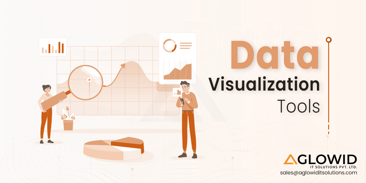
Quick Summary:
Have you ever wondered how raw data is transformed in the captivating visuals? Dive into the world of data visualization tools, tools for data visualization offer dynamic insights, transforming the chaotic data into the eye-catching visuals. In this blog post we will shed light on the various techniques of data visualization, popular data visualization tools and much more!
In this blog, we’re going to discuss📝
- What are Data Visualization Tools?
- Why are Data Visualization Tools Important for Effective Communication?
- What are Popular Techniques of Data Visualization?
- What Factors Should be Considered in Selecting Visualization Tools?
- Best Data Visualization Tools
- What are the Benefits and Challenges Associated with Using Data Visualization Tools?
In an era dominated by the information, the ability to decipher and communicate data efficiently has become paramount. These data Visualization tools stand as a forefront in this digital age, transforming raw, complex dataset into meaningful insights that are not just comprehensible but also actionable.
According to the market growth report, Global data visualization market size was valued at USD 6065.4 million in 2022, and is expected to expand at a CAGR of 9.36% during the forecast period, reaching USD 10374.44 million by 2028. In this rapidly changing ecosystem of data science, data visualization tools aids as the guiding light, where information overhead is constant challenge. From interactive dashboards to intricate charts and graphs, these tools empower users to explore, analyze, and communicate their data in ways that transcend traditional spreadsheets and reports.
There is an increasing number of employees that are well skilled with data, and have an understanding of data and its impact. This is where data visualization tools play crucial role. With the key aim of making data more understandable, these tools for data visualization offer to bridge the gap between raw data and actionable insights. In this blog, we are going to navigate through the vast landscape of data visualization software.
In this blog post, we’ll explore some of the top data visualization tools available today and how they can benefit data analysts, business leaders, researchers, marketers, and more. We’ll look at popular data viz tools like Tableau, Power BI, IBM Watson, Qlik Sense, and more. Examining their key features, strengths and limitations, learning curves, pricing models, and ideal use cases. You’ll learn how these tools allow you to build custom reports, dashboards, and charts to slice and dice data how you want.
Let’s Begin!
What are Data Visualization Tools?
Data Visualization tools are software applications designed to help users represent, analyze, and interpret data visually.
These data visualization software transform the raw data into charts, graphs, maps and other visual elements, making complex information more accessible and understandable for users. These data viz software enable individuals and organizations to uncover patterns, trends and insights within their data, and also helps in better decision-making & communication of information.
Why are Data Visualization Tools Important for Effective Communication?
Data visualization is crucial for effective communication because it transforms complex, and abstract data into visual representations such as charts, graphs, and maps. Visualizations make information more accessible, understandable and memorable. Some of the things that makes data visualization important are as follows:
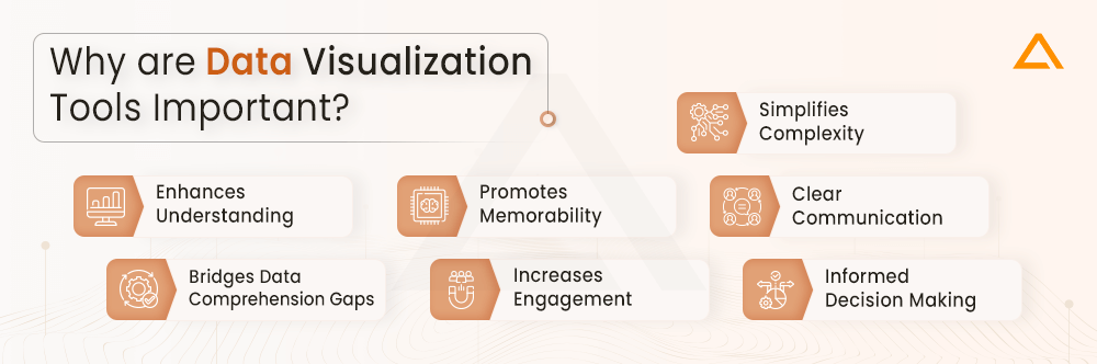
Simplifies Complexity
Data visualization services transforms intricate data into visual forms like chart and graphs for easy understanding.
Enhances Understanding
Data visualization tool facilitates quick grasping of patterns, trends, and insight essential in data
Promotes Memorability
Visualization software makes information becomes more memorable when it is represented in the visual form rather than the raw data format.
Clear Communication
Graph design empowers clear communication of complex information to various range of audience.
Bridges Data Comprehension Gaps
Software data visualization acts as a powerful way to bridge the gap between the raw data & effective communication.
Increases Engagement
Visual used to display data appeals to a broader audience, irrespective of data literacy levels, and it also helps in fostering engagement levels.
Informed Decision Making
Data visualization software empowers stakeholders to make informed decisions based on a comprehensive understanding of the data.
Now, that you know the reasons why it is important to have data visualization tools for effective communication. Let’s move forward to the popular techniques of data visualization.
What are Popular Techniques of Data Visualization?
Techniques of data visualization encompass as a diverse array of methods used to represent information graphically, turning raw data into visual insights. These techniques are instrumental in making complex datasets more understandable and accessible. Some popular data visualization techniques include
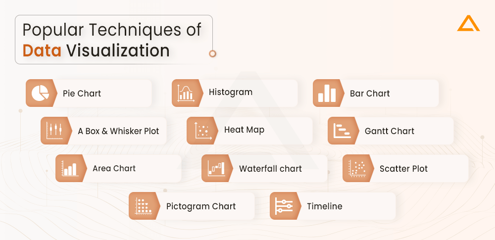
- Pie Chart
- Bar Chart
- Histogram
- Gantt Chart
- Heat Map
- Box and Whisker Plot
- Waterfall Chart
- Area Chart
- Scatter Plot
- Pictogram Chart
- Timeline
Pie Chart
Pie charts are one of the most common and basic data visualization chart tools, used across the wide range of applications.
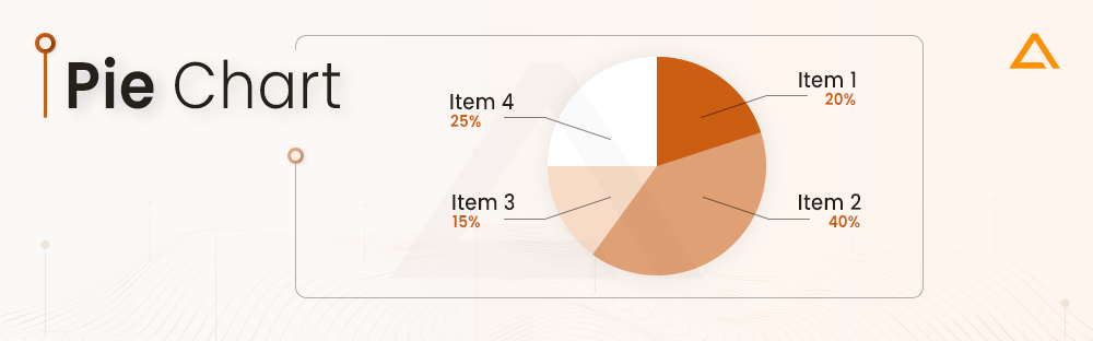
Tailored for illustrating proportions and part-to-whole comparisons, they excel in simplicity and readability. Ideal for audiences seeking key takeaways, pie charts may fall short when complex information demands in-depth exploration. Despite their limitations, their widespread use persists due to their effectiveness in conveying straightforward relationships within datasets, making them an enduring choice for presenting easily understandable visual summaries.
Histogram
In contrast to bar charts, histograms excel in portraying the distribution of data across continuous intervals or defined periods.
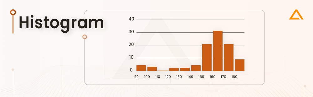
These visualizations prove invaluable in pinpointing concentration, gaps, or outliers within a dataset. Particularly effective in depicting frequency, histograms offer a dynamic tool for showcasing occurrences. For example, tracking daily website clicks over a week can be effectively represented with a histogram, providing immediate insights into peak and off-peak days. Incorporating sophisticated software data visualization tools enhances the power of histograms, allowing for precise analysis and interpretation of refined patterns within datasets.
Bar Chart
The timeless bar chart, or bar graph, stands as a widely employed and user-friendly data visualization technique.
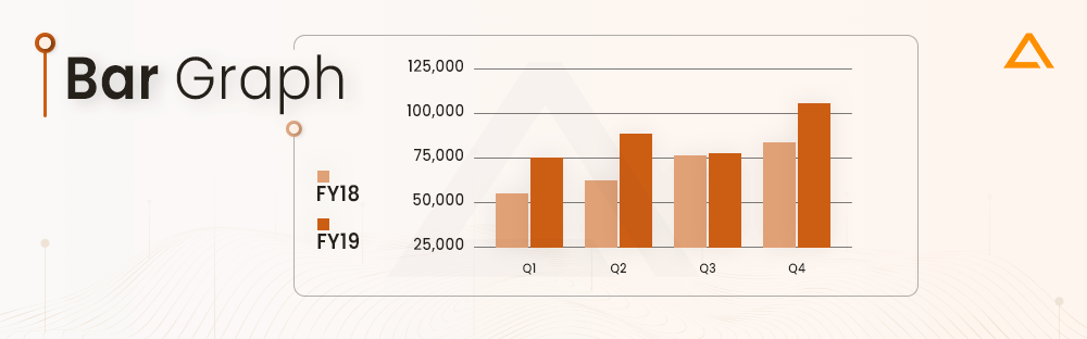
In this method, one axis delineates the categories under scrutiny, while the other represents the measured values. The length of each bar signifies the value corresponding to its respective category. Bar charts offer clarity in presenting comparisons, yet a drawback emerges when a multitude of categories hampers labeling and overall coherence. Similar to pie charts, their simplicity might fall short for intricate datasets, emphasizing the importance of thoughtful graph design for effective communication.
A Box and Whisker Plot
A box and whisker plot, or box plot, serves as a visual tool offering a concise summary of data distribution through quartiles.
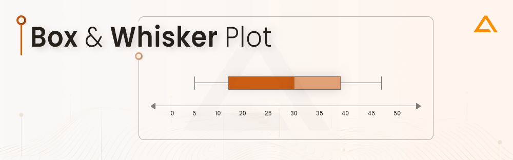
It involves drawing a box from the first to the third quartile, with a line inside denoting the median. Whiskers extend to the minimum (lower extreme) and maximum (upper extreme) values, while outliers align with the whiskers. This chart facilitates quick identification of data symmetry or skewness, providing an easily interpretable visual summary. When paired with a proficient data visualizer, box plots gain additional value, allowing for dynamic exploration and interactive analysis of the dataset’s characteristics and outliers.
Heat Map
A heat map is a compelling visualization method that utilizes color variations to represent differences in data.
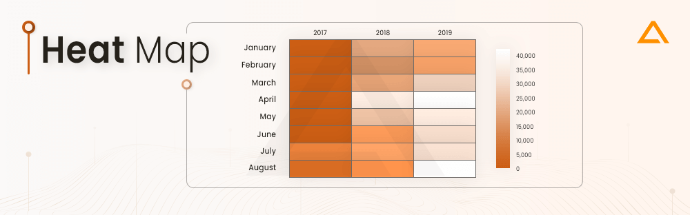
By employing color gradients, these charts efficiently communicate values, enabling viewers to swiftly discern trends within the information presented. A clear legend is essential for users to interpret a heatmap accurately. Heat maps find diverse applications; for instance, in retail analytics, a heatmap can illustrate the most lucrative times for sales by shading in a matrix based on sales data. When integrated with sophisticated visualization software, heat maps offer enhanced capabilities for detailed data analysis and pattern recognition, making them indispensable in diverse fields.
Gantt Chart
Gantt charts, universal in project management, serve as valuable tools for illustrating project timelines and task progression.
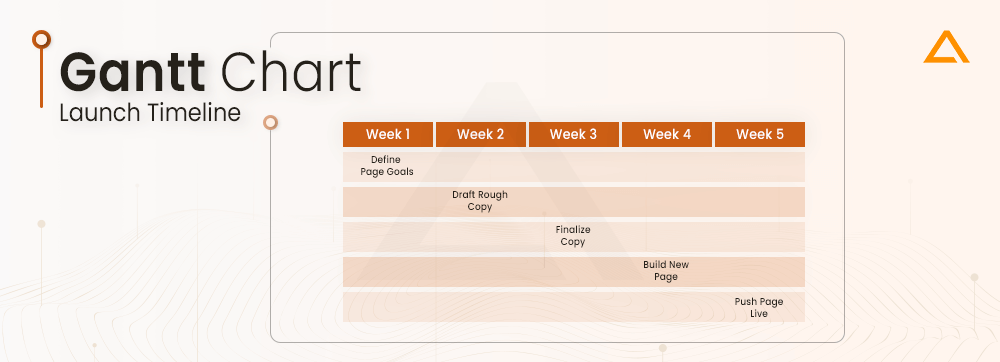
Featuring tasks on the vertical axis and time intervals on the horizontal axis, the chart’s horizontal bars signify the duration of each activity. Employing Gantt charts aids in comprehensive project oversight, allowing team members to monitor tasks efficiently. Regardless of one’s professional background, understanding Gantt charts fosters organizational skills. When coupled with data visualization software, Gantt charts become even more potent, offering enhanced capabilities for precise project planning, monitoring, and collaboration.
Area Chart
An area chart, also known as an area graph, is a nuanced iteration of a conventional line graph where the space beneath the line is shaded to portray the total value of each data point.
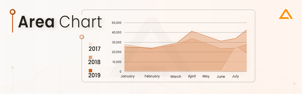
When comparing multiple data series on a single graph, stacked area charts come into play. This method of data visualization is particularly adept at illustrating changes in one or more quantities over time, offering insights into both individual trends and their cumulative impact. Stacked area charts, especially effective in conveying part-to-whole comparisons, contribute to a comprehensive understanding of complex datasets. Integrating map data visualization enriches the analysis, allowing for a spatial exploration of correlations and patterns within the data, expanding the scope of insights for diverse applications.
Waterfall Chart
A waterfall chart serves as a compelling data Visualization tool depicting the evolution of a value under the influence of various factors, often over time.
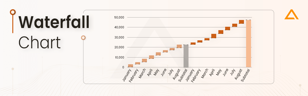
This chart tools is instrumental in illustrating the growth or decline of a value across a defined period, offering viewers a clear understanding of the contributing factors. Frequently utilized to showcase financial data such as spending or earnings trends, waterfall charts provide a brief overview. When seamlessly integrated with map visualization, these charts gain added depth, allowing for a comprehensive exploration of geographic patterns and correlations within the dataset, enriching the analytical capabilities for diverse applications.
Scatter Plot
A scatter plot is a widely-used technique for visually representing data, wherein points are plotted against both horizontal and vertical axes to showcase two variables.
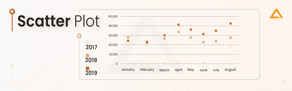
This type of data visualization proves valuable in elucidating relationships between variables, facilitating the identification of trends or correlations within the data. Scatter plots are particularly effective with larger datasets, as the abundance of data points enhances the visibility of trends. The proximity of data points is indicative of the strength of correlation or trend. Integrating map data visualization within this context extends the analytical capabilities, offering spatial insights into relationships and patterns, thereby broadening the spectrum of interpretative possibilities across various domains.
Now that you have understanding about the popular data visualization techniques, let’s understand what are the metrics that you should keep in mind while selecting the data Visualization tools.

Hey!!
Looking for Data Engineering Service?
Revolutionize Your Data Infrastructure with Cutting-Edge Engineering Services from Aglowid IT Solutions!
What Factors Should be Considered in Selecting Visualization Tools?
Choosing the right Data Visualization tools is vital for effective data communication and analysis. There are several factors that should be considered while selecting data visualization software.
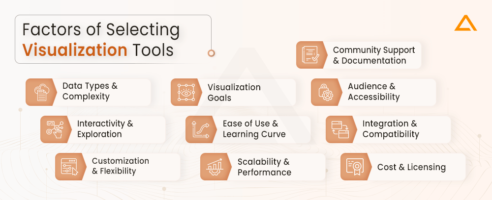
Data Types and Complexity
- Consider the nature of your data—whether it’s numerical, categorical, temporal, or spatial.
- Assess the complexity of your dataset, as some tools are better suited for handling intricate or large-scale data.
Visualization Goals
- Clearly define the objectives of your visualization. Are you trying to identify patterns, trends, or outliers?
- Determine the story you want to convey and choose tools that align with your communication goals.
Audience and Accessibility
- Understand your audience’s level of familiarity with data visualizations. Choose tools that cater to their expertise or provide sufficient clarity for understanding.
- Ensure the selected tools offer accessibility features if you have diverse audience needs.
Interactivity and Exploration
- Assess the need for interactivity in your visualizations. Some tools allow users to explore and interact with the data dynamically.
- Consider whether drill-down, filtering, or other interactive features are essential for your use case.
Ease of Use and Learning Curve
- Evaluate the usability of the tools. Opt for tools that are user-friendly and align with your team’s skills.
- Consider the learning curve associated with each tool, especially if rapid deployment is essential.
Integration and Compatibility
- Ensure the selected tools can integrate seamlessly with your existing data sources, databases, or platforms.
- Check for compatibility with various data formats and file types to avoid data conversion challenges.
Customization and Flexibility
- Assess the level of customization offered by the tools. Choose those that allow you to tailor visualizations to suit specific requirements.
- Consider tools that offer flexibility in terms of design, layout, and data representation.
Scalability and Performance
- Evaluate the scalability of the visualization tools to handle growing datasets or increasing user loads.
- Consider the performance metrics, such as rendering speed and responsiveness, especially with large datasets.
Cost and Licensing
- Take into account the cost of acquiring and maintaining the visualization tools.
- Consider licensing models, subscription fees, and any additional costs for advanced features.
Community Support and Documentation
- Check for community support and user forums. Robust community support can be valuable for troubleshooting and sharing best practices.
- Evaluate the availability and quality of documentation to ensure smooth implementation and usage.
By considering these factors, you can make informed decisions when selecting visualization tools that align with your specific needs and objectives.
Best Data Visualization Tools
There are several popular data visualization tools available in the market. They have gained popularity for their efficiency and features. But keep in mind that the top data visualization tools for your specific needs depends on the various factors such as data visualizer needs and user preferences. Here are some of the best data visualization software:
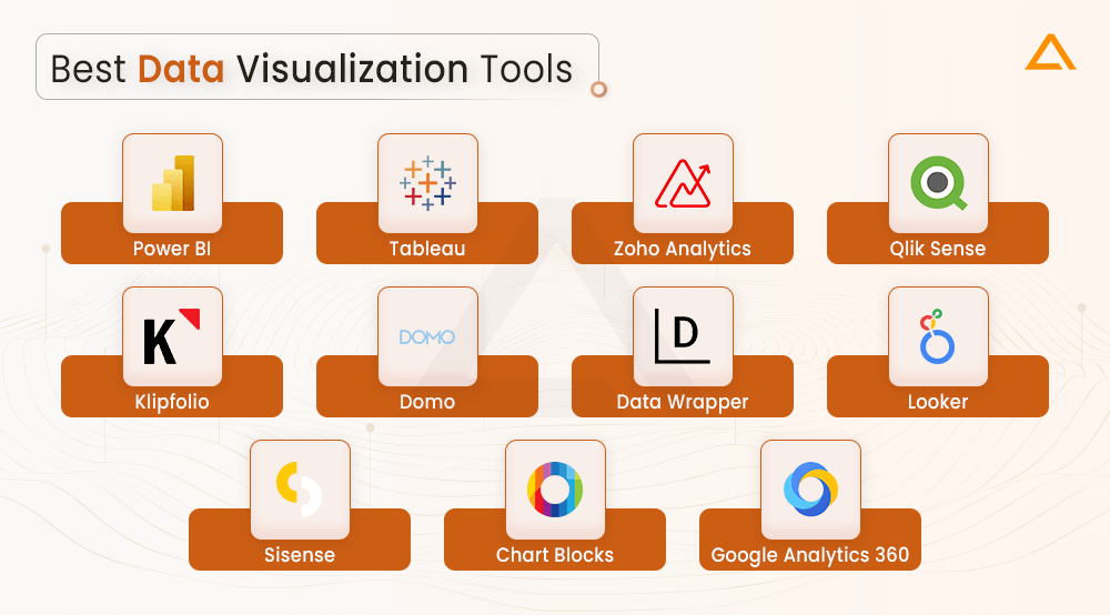
Power BI | Freemium
Power BI is a robust business analytics tools by Microsoft. It is designed to empower users to analyze and visualize their data efficiently. As a part of Power platform, Power BI offers a complete set of features for data visualization, transformation and connections. Some of the key features of Power BI includes:
- Row Level Security
- Data Connectivity
- Data Transformation
- Report Authoring
- AI-powered understanding
- NLP Processing
- Microsoft Ecosystem Integration
Pricing of Power BI
| Plans | Pricing |
| Free Account | Free |
| Power BI Pro | $10.00 – user/month |
| Power BI Premium Per User | $20.00 – user/month |
| Power BI in Microsoft Fabric | Starts from $5,002.67/month |
Tableau | Freemium
Tableau is a top business intelligence visualization tool. This viz tool helps user in transforming raw data into the meaningful insights via interactive dashboard data Visualization. Here are some of the key features of Tableau:
- Advanced analytics
- Interactive dashboards
- Tableau Prep
- Integration with other tools
- SSO integration
- Mapping features
- Data Connectivity
Pricing of Tableau
Note: These pricing are for individual user for organization you need to connect the vendors.
| Plans | Pricing |
| Tableau Creator | $75.00 user/month (billed annually) |
| Tableau Explorer | $42.00 user/month (billed annually) |
| Tableau Viewer | $15.00 user/month (billed annually) |
| eLearning | $10.00 user/month (billed annually) |
| eLearning for Explorer | $5.00 user/month (billed annually |
Zoho Analytics | Premium
Zoho Analytics also known as Zoho reports is a comprehensive visual analytics tools for business visualization. This data visualization platform authorizes the business with data-driven perceptions from various sources. Here are some of the key features of Zoho analytics:
- Embedded BI
- Data Integration
- Augmented Analysis
- Unified Business Insights
- Mobility
- Data Storytelling
Pricing of Zoho Analytics
| Plans | Pricing |
| Basic | $24 |
| Standard | $48 |
| Premium | $115 |
| Enterprise | $455 |
| Custom | Contact Vendor |
Qlik Sense | Freemium
Qlik Sense is a business intelligence data visualization tool. It is known for its user-friendly interface associatory data modeling. It allows the users to analyze and explore the data, building personalized dashboards, and creating interactive visuals. Qlik sense supports both enterprise-level solutions and self-service analytics. Here are some of the key features of Qlik Sense:
- Associated data modeling
- Advanced analytics support
- Robust security measures
- Self-service data visualization
- Storytelling and reporting capabilities
Pricing of Qlik Sense
| Plans | Pricing |
| Standard | $20 user/mo |
| Premium | $2,700 /mo |
| Enterprise | Connect to Vendor |
Klipfolio | Freemium
Klipfolio is a Canadian business intelligence firm, and is best known for its excellent data Visualization tools. This tools for data visualization offers seamless connectivity to a variety of data sources, it can be any xml file, databases, spreadsheet. Users can easily create the representation of unique visualization by dragging and dropping charts and graphs. One of the strongest points of Klipfolio is its ability to handle complicated data and using tools to complete complex calculations. Here are some of the key features of Klipfolio.
- Various Data Sources Integration
- Dynamic dashboard creation
- Role based access control
- Data Exploration & Analysis Tools
- Automated data refresh
- Tailored drag-n-drop visualizations
Pricing of Klipfolio
| Plans | Pricing |
| Free | Free |
| Standard | $250/month |
| Custom | $800/month |
Domo | Freemium
Domo is a tool for data visualization that carries visions for decision-making by examining data. You can use it to create the predications, find solutions to the problem and look in to the what-if scenarios. Although it was first designed for analytics in mind, this data visualization platform provides support to both the designers and the developers. Some of the key features of Domo are as follows:
- Data Integration
- Embedded Analytics
- App Creation
- Security & Governance
- BI & Analytics
Pricing of Domo
| Plans | Pricing |
| Free Forever | Free |
| Standard | $300/mo |
| Enterprise | Contact Vendor |
| Business Critical | Contact Vendor |
Data Wrapper | Freemium
Data Wrapper is an easy-to-use platform for data visualization tool. It gives users the ability to create a variety of charts and maps. Its user-friendly interface and adaptable design make it easy to create different kinds of charts that can be tailored to fit individual requirements. Interactive visualizations may be embedded into webpages with ease thanks to options for connectivity and seamless data import. In order to create dynamic charts and emphasize accessibility for powerful presentations and information sharing, automated data labeling, collaborative tools, and export options are added to further improve the user experience. Here are some of the key features of Data Wrapper.
- Export as PNG, PDF
- Maps
- Chart type and style choice
- Layout customization
- Color options
- Live chart updates
Pricing of DataWrapper
| Plans | Pricing |
| Free | Free |
| Custom | $599/mo |
| Enterprise | Contact the vendor |
Looker | Free
Google’s Looker stands out as a skilled data Visualization tool, investigating deep into data for insightful analysis. It allows detailed examination allowing businesses to quickly frame choices based on a learnt visual insight. Looker seamlessly integrates with over 50 SQL supported dialects, ensuring the smooth connectivity across multiple databases. Here are key features of Looker:
- LookML modeling language
- Data Visualization
- Embedded Analytics
- Integrated Data Governance
- SQL Query Generation
- Looker Blocks
Sisense | Free
Sisense is a bi visualization tool that lets your team gather insights and pull data from different sources. It’s well-known for its embedded analytical features due to open-source integration and RestAPI access. However, users have found that it takes some time and effort to set up and understand, especially when dealing with configuring data cubes. So, getting familiar with the platform and unlocking its full potential might take a bit of time. Here are some of the key features of Sisense:
- Data preparation & modeling
- Embedded Analytics
- Dashboard creations
- AI powered Analytics
- Ad Hoc Analysis
- Rest API Access
Chart Blocks | Free
Chart Blocks simplifies chart creation by automatically selecting relevant data segments and managing import from any source. With versatile sharing options, it enables quick website embedding. The Wizard feature streamlines data selection and import, ensuring charts are generated within minutes, eliminating the need for coding. Users easily create, design, and customize charts, seamlessly embedding them into websites and sharing through social media tools like Facebook and Twitter. The tool also allows exporting charts as editable vectors and graphics. Here are some of the key features of chart blocks:
- Wizard Features
- Quick Data Import
- Versatile Data Source
- Automatic data import
- Social Media Integration
- Export Options
- No code Requirements
Google Analytics 360 | Premium
Google Analytics 360 is paid is a powerful tool for big businesses. It helps understand how users interact with websites and apps. With features like tracking across different platforms and insights into user behavior, it lets businesses improve their digital strategies. Designed for large enterprises, it’s flexible and can be integrated into various systems, providing a strong foundation for making smart decisions based on data. Here are some of the features of Google Analytics 360:
- Raw data access
- Multi-Touch
- Data-driven attributes
- DoubleClick and Big Query integrations
- Support for Enterprise-level service
The Google Analytics 360, costs around $12,500/per month or $1,50,000 per year.
What are the Benefits and Challenges Associated with Using Data Visualization Tools?
It may seem that something as simple as presenting data in graphics format may seem to have no challenges. But it can happen that sometimes the data representation may be misinterpreted or misrepresented. When you are thinking of integrating data visualization tools in your project it is important that you keep in mind both the advantages & disadvantages of data visualization tools.
Data visualization tools play a critical role in converting complex datasets into reachable visual formats. These tools helps in effective communication, and streamlining the analytical process.
Following are some of the advantages of data visualization tools:
- Clarity & Understanding
- Identify Trends & Patterns
- Improved Communication
- Quick Decision Making
- Data Exploration
- Real Time Monitoring
- Enhanced Collaboration
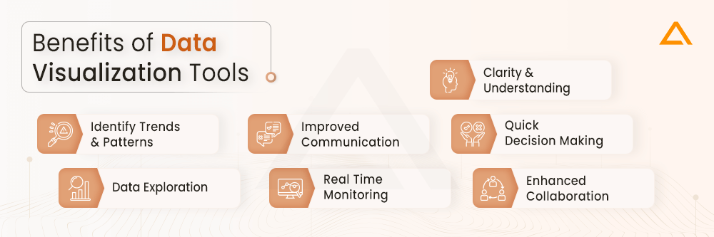
Data visualization tools stand as vital resources, simplifying complex datasets into clear visual forms. As organizations increasingly depend on on these tools, understanding their impact is crucial for effective and knowledgeable decision-making processes.
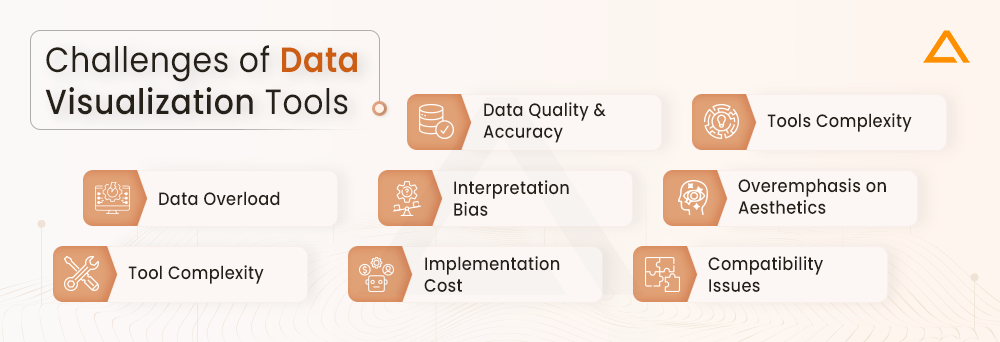
Here are some of the disadvantages of data visualization tools:
- Data Quality & Accuracy
- Tools Complexity
- Data overload
- Interpretation Bias
- Overemphasis on Aesthetics
- Tool complexity
- Implementation Cost
- Compatibility issues
Wrapping Up!
Data visualization tools allows deeper data analysis and easier insight sharing through impactful visuals. Choosing the right tool requires evaluating key factors like data connectivity, analytics, and skills. Leading options provide customization and interactivity enabling users to engage data hands-on. But effective adoption requires cultivating data literacy and sound design skills, not just technology. With the right approach, data visualization unlocks richer storytelling and augments (not replaces) data-driven decision making. Ultimately, it’s about asking incisive questions and taking purposeful actions.


 Say
Say