Quick Summary:
Do you have a Shopify ecommerce site? Do you notice a heavy traffic flow but an alarmingly lower conversion rate? Are you looking for answers to ‘how to design Shopify store to increase sales? Look no further; we are here to help you get the most out of your Shopify store by focusing and working on some of the top Shopify UI/UX best practices.
Any ecommerce or product-driven platform aims to sell the product(s) to a wider target audience. From initial site visit to final checkout, the customer journey’s ease and seamlessness significantly impact the chances of conversions on your ecommerce store. Just as important as customer journey optimization (CRO), you should also focus on customer experience of your website.
Your visitors should, firstly, not have to wait for your website’s first page to load for more than 2-3 seconds. Second, they should be instantly hooked or intrigued by your site offering by the content presented to them on the first fold of your home page. Third, they should easily be able to recognize your brand by attributes such as colors, logo, brand philosophy, or content. You want your Shopify store to leave an impression, so even if the user has 12 tabs open on their browser, they still know which one to return to after facing disappointment in the 11 others.
We discussed all that should be done, but the question remains – How?
- How to improvise Shopify UI on your existing ecommerce platform?
- How to ensure your new Shopify webstore’s UI/UX is built to the standards of higher conversion?
Let’s find the answers to all the questions around Shopify UX best practices together without any delays!
Shopify Website Design Best Practices and Tips to follow in 2024
Designing without any pre-set agenda is doodling. And we don’t want to doodle. Purpose-driven Shopify store design will not only help drive better engagement, but it will also help you be in more control of your ecommerce store. There is a lot to cover in aspects of Shopify custom design improvements. For your convenience, we have divided these Shopify UX tips into different sections of your Shopify store. Without any further ado, let’s dive right into optimizing your Shopify website customization and design –
Shopify Store Design Tips for Overall Website
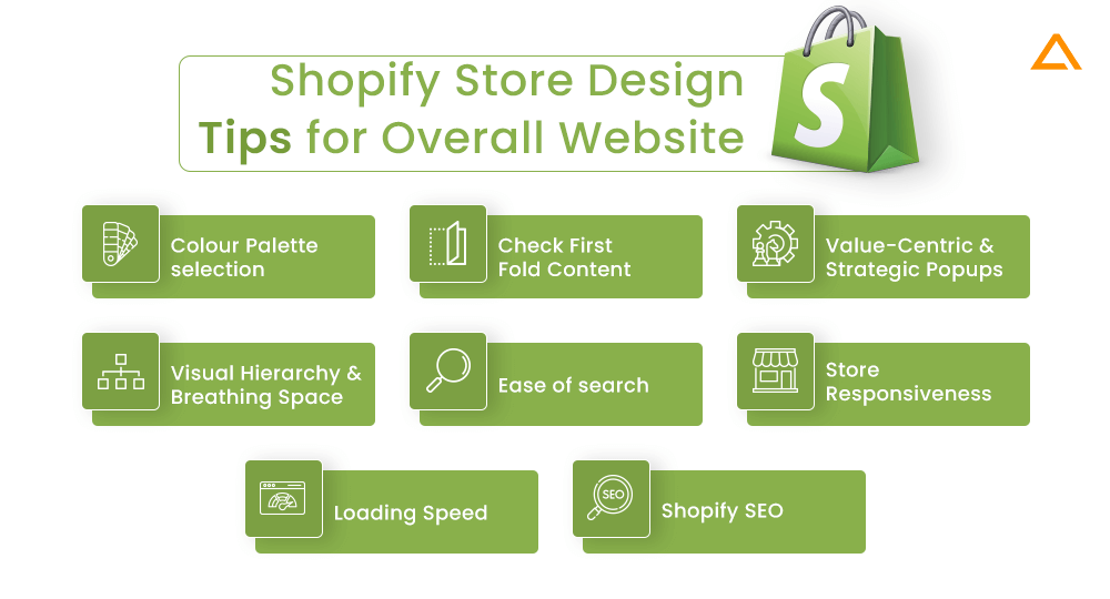
Aim: Improving chances of conversions, overall visual appeal, and relevance of Shopify Store.
Some tips and best practices in designing Shopify store stand true throughout the site and must be implemented at the core of your design philosophy. Doing so will help ensure your Shopify website is not just another generic ecommerce site and help you establish a visual identity that will help attract and retain users’ attention. Here are some of the Shopify design best practices to implement throughout your website:
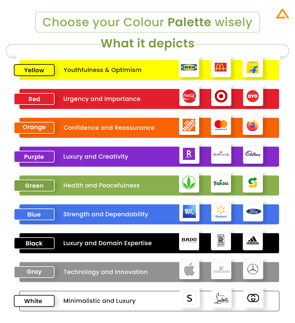
Choose your Colour Palette wisely
Colors have a huge psychological and subconscious impact on customers’ perception of anything they interact with. Warmer shades evoke emotions like warmth, comfort, and trust, while cooler tones generally depict traits like reliability and strength. Here is a quick explanation of how different colors can be used as per color psychology for ecommerce sites:
Pay Attention to First Fold Content
What is the first thing your visitor will see when they enter your site? Well, it depends on what page they are coming from, but if they enter your URL on the browser, they will first be directed to your homepage.
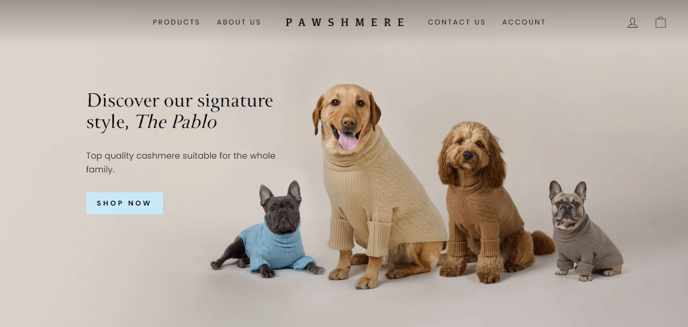
The first fold content is the upper half of your homepage, the first point of any interaction between the visitor and your Shopify Store. Generally, it is advisable to use bold and full-banner images with a smartly placed copy that offers a value proposition. You should also place an appealing CTA below it to allow visitors to engage with your products. As you can see in our Shopify Project – Pawshmere, where the first fold of the site has some adorable dogs with their even more adorable Pawshmere sweaters, a copy line about the product with a crisp CTA to drive engagement.
Learn More About how we helped : Pawshmere -The Shopify Store for Dogs.
Pro Tip – You can also make use of an immersive background video to increase engagement
Add Value-Centric and Strategic Popups
You will hear many people’s lousy mouths about popups, saying it’s disruptive to the user experience and feels like forced spam when users browse the site. In contrast, adding strategic popups at the right places and with the right copy can be a gold mine for boosting your Shopify store’s conversion ratio.
How not to add Popups?
Let’s visualize this as an offline shopping experience. You have just entered a shop and are gauging your eyes to see all the available products. Suddenly a salesman appears out of nowhere, repeatedly asking you what you are looking for. You might get annoyed and leave the store as quickly as you can. This happens when you add popups to landing pages where it has no relevance to the users. This annoys the user, and they, too, leave your site as soon as possible, which increases the bounce rate and reduces the chances of conversion.
How to add Popups effectively
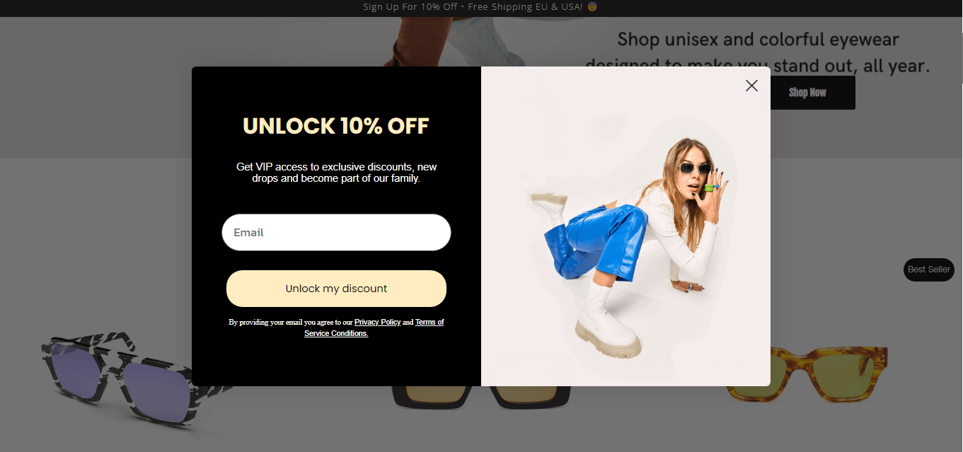
Remember, all Shopify design elements you use for your store have to aim to provide value to the customer. For instance, if you visit another one of our Shopify projects – Ameos Eyewear, upon scrolling for a bit, you will notice an immediate popup that only asks the visitor for their email id with the benefit of unlocking their discount code.
This is beneficial to the store as they get more visitor data to push mail forward to and to the customer as they feel a sense of exclusiveness since the discount code gets sent to their mail id.
Learn More About how we helped: Ameos Eyewear – Unisex Eyewear Store
Visual Hierarchy and Breathing Space
There is a visual hierarchy guideline that highlights the area of the websites where a user’s attention is naturally going to go first. You should use this visual hierarchy guideline to guide the visitor’s eye to the most important information first, then supporting content if needed. One way to do this is by using bigger or highlighted fonts with a color difference to highlight important parts of your content.
However, just because we can differentiate between the priority of actual and lesser important content, we should not exploit the home page with excessive information that can prevent the visitor from wanting to make any sense of it.
Ease of Finding the Right Product
Different visitors to your Shopify store would have different intents or be at different stages of the sales channel; hence you need to address all their needs for improved conversions. Primarily there would be two distinctive types of customers – one who knows what product they want and want a quick product discovery and checkout process to make the purchase as soon as possible, let’s call them customer A. The other would be the visitor casually browsing your Shopify store, seeing if there’s anything worth purchasing; this is customer B.
For catering to customer, A, you need advanced filters and search options so they can find the product they’re looking for without having to navigate around your site. For customer B, you need adequately divided categories in the form of Shopify collections that can be managed automatically or manually. You also need to provide them with features like suggestive search and appeal to them with special offers.
What your Shopify Store Search function should include –
- It should be placed at a visible and easy-to-find location (top right corner of home page)
- It should have autocomplete or autocorrect options
- It should have placeholder content that encourages the customer to search (what are you looking for)
Make your Shopify Store Responsive
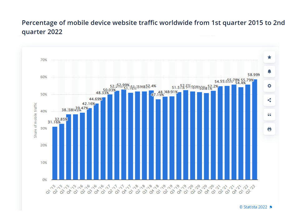
E-commerce is an industry were having a mobile-first design is paramount if you genuinely want to succeed. According to a study by Statista, mobile phones generated more than 58.99 percent of global website traffic in the second quarter of 2024. This shows the need to design responsive Shopify stores. Luckily, Shopify comes with all the necessary tools to easily make Shopify responsive design.
Optimize Shopify Theme Loading Speed
When developing your Shopify store, you might choose one of the many ready-made templates to handle the base of your Shopify store design. However, chances are some of these Shopify templates have a slower page speed, meaning the content would take more time to load on your live website, and there will be a delay in the time it takes for users to get to experience your website. This will also increase the bounce rate of your site.
Ways to assess and improvise Theme Loading Speed:
- Use Online Tools such as Google PageSpeed Insights.
- Use in-house tools for Shopify, such as Lighthouse.
- Remove unnecessary elements that slow up the site.
Pro Tip:Hire Shopify Design Agency that knows how to develop a custom Shopify theme as per your brand identity and get more control over page loading speed and other technicalities.
Work on Shopify SEO
SEO is the best way to drive organic traffic to your ecommerce site. Optimizing the Shopify store is comparatively more difficult than running an ecommerce site on WordPress using WooCommerce.
However, it isn’t impossible. By fine tweaking some aspects of your Shopify site and using Shopify tools that help with SEO, you can rank your site on your most crucial customer intent keywords, which would help drive better traffic and, ultimately, better results.
Shopify SEO Optimization Tips
- Have a blog section. Provide valuable insights about the domain, products, and related topics. Blogs are more accessible to the rank and portray you as a thought leader in your domain.
- Categorize your products into valuable collectibles users are most likely to search for.
- Conduct proper keyword research and optimize all the copy on your site.
- Work on improvising the overall site’s structure and responsiveness.
- Check and remove duplicate content.
- Hire Shopify Professionals with coding knowledge and experience.
Shopify Website Design Best Practices for Product Pages
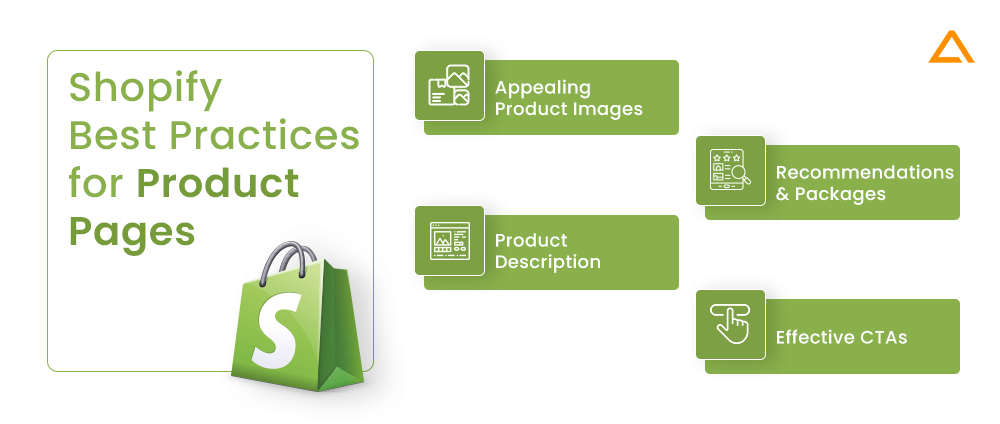
Aim: Motivate customers to make purchases, inform them about product offerings, and attempt to make them add more items to the order
Next, we also need to pay special attention to Shopify Page Design for Products since this is the dedicated page for each product from where the customer/visitor can inspect the product in greater detail before making their final decision to ‘add to cart or ‘buy now or entirely abandon the purchase. It is important to maintain and hold the potential buyer’s interest on this page. For this, you need to follow some of the Shopify best practices that will help you increase your chances of conversion –
Make use of Appealing Product Images.
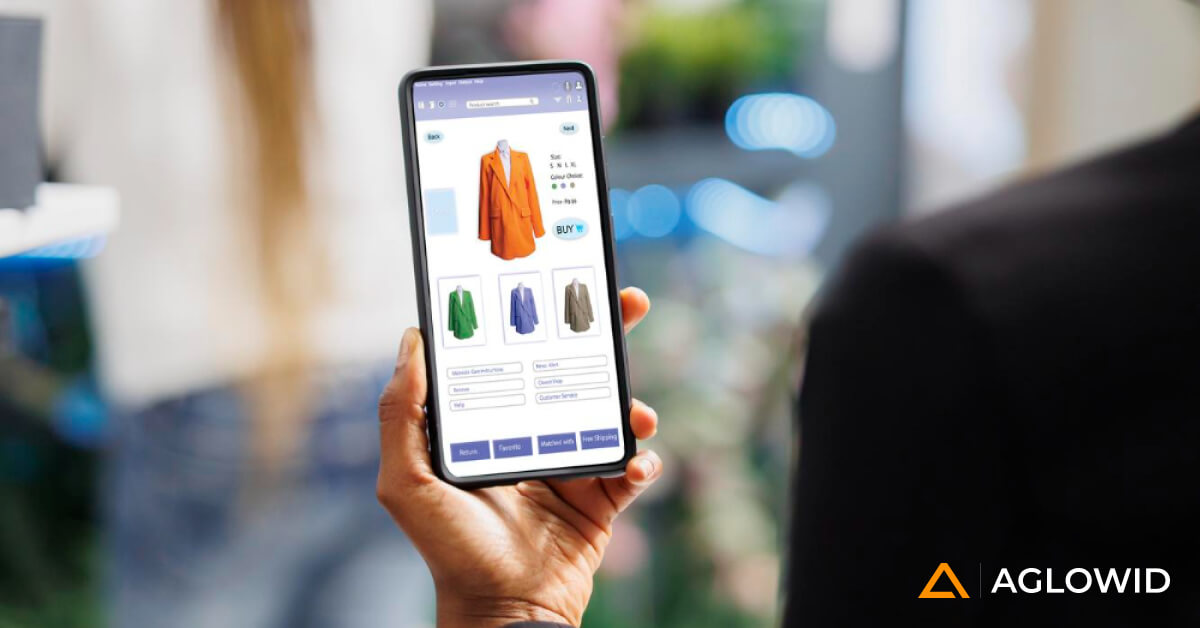
For any ecommerce website, images and visuals play the most important role in making the site feel more authentic, appealing, and engaging. Luckily Shopify as a platform understands this and allows users to upload various images and product variants.
One of the Shopify design best practices for product image suggests that the product you are selling should be displayed to scale by keeping it against other common objects in the surrounding. This establishes trust and provides clarity to the customer. You should also ensure all the images are of the highest quality and zoomable.
Product Image Best Practices in Shopify Store Design:
- Upload at least one image to scale
- Provide 360 coverage of the product
- Upload a video of how the product should be used
- Upload multiple pictures from different angles
- Upload optimal quality images as per Shopify Standards – Highest: 4472 x 4472 px with the file size of 20 MB or 2048 x 2048 px (suggested by Shopify).
For instance, in the Pawshmere Shopify Store we worked upon, we primarily focused on the product’s visual appeal to drive conversions by providing all the available colors, sizes, gender attributes on the right, and snapshots of all three profiles for each available color. Users can also zoom in on the product to see it in finer detail and buy the right color Pawshmere sweater for their dogs!
Crisp Product Description
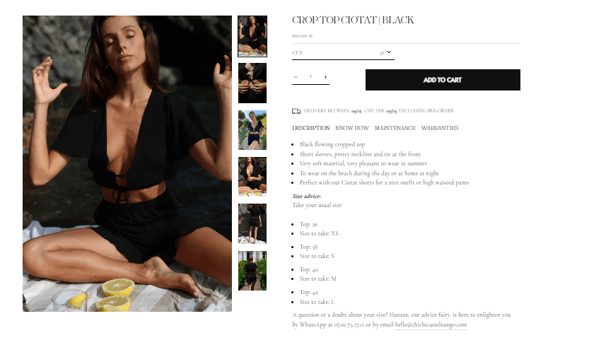
As you can see on the ChiChi Castelnango Paris store, a luxury brand Shopify project we worked on, the product description is fairly easy to read and glance through. Yet it provides all the important information about the product in a bulleted list with tab design broken down into DESCRIPTION, KNOW HOW, MAINTENANCE, and WARRANTIES.
Images alone cannot sell a product. They are a visual aid of how the product would look and feel. However, the product description genuinely explains the product offerings to a customer and gives them a reason why it’s worth purchasing. In the product description section, you must be informative and selling. You can’t lie about features that don’t exist, but you need to sell the benefit of your product’s feature in a way that appeals to the user.
How to make your Product Description more appealing:
- Make sure the product description is scannable with bulleted points and use other text formatting options
- Provide social proof if you have an existing client base
- Make use of sensory words to appeal to the senses of the users
- Help users paint a picture in their minds about using your product
- Don’t fill the content with bland phrases like ‘excellent product quality
- Highlight product benefits
- Identify the pain points of the potential buyer
- Add necessary keywords to match the user’s search intent
Accurate Product Recommendations and Packages
How often does it happen to you as a user that you are on an ecommerce site like Amazon, maybe purchasing a smartphone and on scrolling down on the product page you see a package deal with two other related products to your smartphone, for instance, a back cover and a protective glass available at a considerably discounted price.
Doesn’t that motivate you to spend that extra bucks and buy two more products you initially hadn’t even thought about purchasing? That’s the power of practical and intelligent product recommendations. Moreover, you should also provide alternative products that justify the price segment of the customer’s current product and its purpose. This will help customers browse through various options if they are dissatisfied with one.
Check the ‘You May Also Like section of Longbottom & Co – a Shopify-based website we built for our clients.
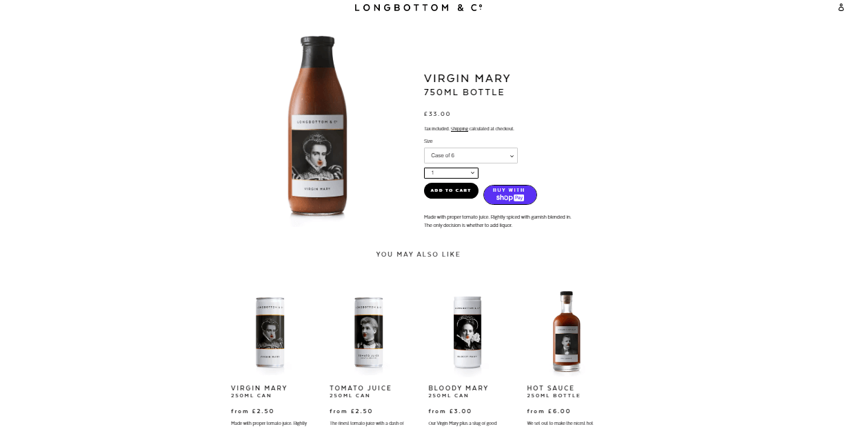
Pro Tip – Add a ‘Add to Compare’ feature, so customers can compare and contrast the features and benefits of various products that match their requirements to make a practical choice without having to switch between all products to compare them.
Effective CTAs
You can have the most well-designed Shopify product page with all the right content and images. Still, if you don’t provide the user with the most straightforward and appealing CTA, you will never be able to convert those potential customers to actual customers. The placement of the CTA, the style and color, the copy of the CTA, and all such small nuances play a bigger role in deciding how effective it is for inducing users to go ahead with the purchase.
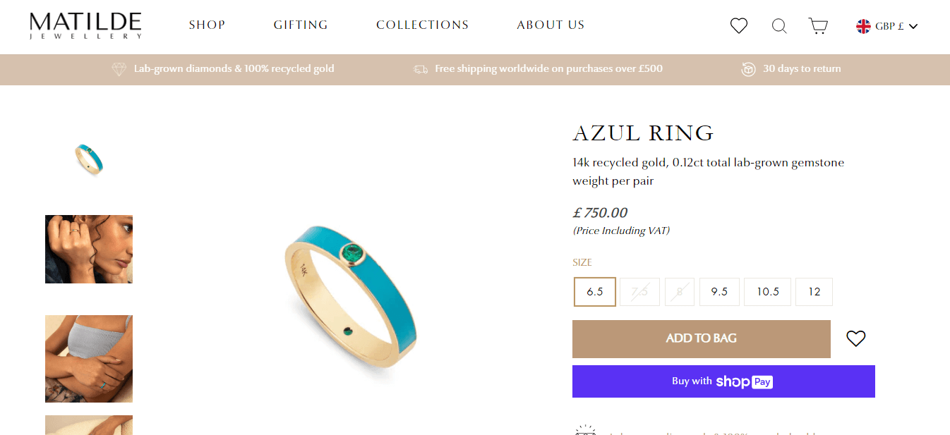
For this luxury jewelry brand Shopify Store – Matilde, we went with ‘Add to Bag’ CTA instead of the standard ‘Add to Cart’ since its more apt with their product lines, and such quirks also give customers a sense of reassurance that they are purchasing jewelry from a reliable brand.
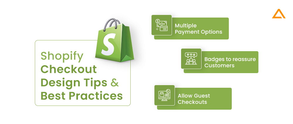
Shopify Checkout Design Tips and Best Practices
Aim: Provide flexibility of payment options and instant checkout process and establish a sense of reliability.
As per Baymard Institute’s 10 years of large-scale checkout testing, if we focus on improving the checkout page design, an average large-scaled ecommerce site can improve its conversion rate by 35.26%. The checkout page is the final page between a potential visitor becoming a customer. It is the final test of your Shopify store and your ability to convert potential leads to sales. Here are some not-so-difficult ways of implementing effective ways of improvising the Shopify checkout page –
Adding Multiple Payment Options
It’s simple. You may have support for 7 different payment gateways, but your potential customer might not have either of those facilities to pay for the product they want. Wasting such a positive conversion over the inability to pay on the vendor’s end is the most terrible thing to happen. Hence, you should ensure you provide all important payment gateways that your customers will likely be using or expecting.
Place Badges and other Assets to reassure Customers
What is one thing that could be the biggest hindrance or hesitation that stops the potential buyer from becoming one? Security risks and insecurity. Remember, a customer has to trust you with their financial information to make a transaction. Misusing such information or getting it into the wrong hands can be extremely risky for that user.
Now you may have all the security protocols to assure their safety, but what good is it if it isn’t conveyed to them? Hence, you should add any security certifications on the checkout page to reassure your site visitors of the safety of the transaction they are about to make. This will help improve conversions by a considerable margin.
Allow Guest Checkouts
Users who create an account on your Shopify Store get the benefit of managing and tracking their orders, having saved addresses and stored payment information. This is all good, but if a new visitor comes to your site and is forced to sign-up for an account after reaching the final checkout page, they will abandon the cart and leave your site.
You shouldn’t force visitors on your site to sign-up with your services as it could throw them off and it is an additional hassle. Allowing guest checkouts builds a sense of trust, improves their perspective of your brand, and lets them see the quality of service, which might motivate them to sign up eventually.
What is Shopify Design System? Why should I care?
Shopify Polaris Design System is a set of broad principles and guidelines provided by Shopify to help Shopify merchants build appealing apps on their platform. It comes with various out-of-the-box resources and construction tools. It helps maintain consistency and uniformity in your Shopify store design.
Why should you care? Shopify Design System Benefits
Adapting Shopify Design Systems has many benefits, which makes it worth your time dabbling on. Here are some of the top benefits:
- Time-Saving – It has a fixed design structure, which might feel limiting at first, but helps reduce time significantly.
- Open-Source – Shopify Polaris is an open-source project. This means if, in any case, you shift to another ecommerce platform, you can carry its benefits to your new ecommerce platform as well.
- Manage Brand Identity – Polaris provides valuable tools to add brand logos and other brand recognition features to your Shopify store.
- Consistency in Maintenance and Updates – Constant updates and maintenance will ensure you get the latest design trend suggestion and improvements for your Shopify site.
- Easy to Learn – Using Polaris for Shopify doesn’t require technical expertise. There are enough guides and follow-along available that non-technical business owners can use.
have a unique Online Store Idea?
Hire Certified sHOPIFY Developers To Build Robust Feature, Rich App And Websites
Wrapping up!
These are the ultimate Shopify UI/UX Tips and Best Practices to ensure higher conversion and improve your overall Shopify store design significantly. All these suggestions have been derived from several Shopify projects we have worked on for different clients belonging to different niches. Choose us as your Shopify development agency for any of your Shopify development requirements.