Share Your Requirements
Tell us about your project needs and compliance requirements
Get expert Angular solutions and strategic guidance from our senior developers to ensure your projects succeed.
We develop scalable, high-performance Angular web applications tailored to your business needs.
We help you to develop fast, secure, highly responsive and user-friendly single-page applications (SPA) using Angular.
Customize your Angular projects with bespoke plugins, modules & directives that fit your unique requirements.
Improve the efficiency and performance of your Angular applications with our best practices and optimization techniques.
We assist you in transitioning your existing projects to Angular, ensuring improved performance, scalability, & access to advanced features.
Tell us about your project needs and compliance requirements
Meet our top Angular developers who understand your business
Begin your project with full compliance and NDA protection
Handpick Angular experts who fit your workflow, start quickly, and drive measurable results.
Get Started Now| In-House | Aglowid | |
|---|---|---|
| AI Edge | Maybe | Advanced AI-assisted development for faster delivery, cleaner code, and reduced errors |
| US Compliance & NDA | Yes | 100% Guaranteed |
| English Proficiency | Native | Fluent Business Level |
| US Time Zone Availability | Yes | Synchronized Operations |
| Data Privacy Compliance | Yes | GDPR/CCPA Certified |
| Time to Get Developers | 4-12 weeks | 1-2 weeks |
| Pricing (weekly avg) | 2.5X | 1.5X |
| Project Success Rate | Low | 98% Success Rate |
Every project is protected by comprehensive legal agreements including NDAs, IP protection clauses, and GDPR/CCPA compliant data handling procedures. Your intellectual property remains 100% yours.
IP Protection Guaranteed
Perfect for short-term projects & specific development tasks with flexible scheduling.
Ideal for ongoing projects requiring dedicated developer resources with consistent delivery.
Scale your team with multiple Android App experts & enjoy significant cost benefits.
We understand diverse business requirements and deliver tailored solutions that align with your operational, technical, and compliance needs.
Leverage AI-assisted development with tools like Cursor AI and GitHub Copilot to accelerate delivery, reduce errors, and ensure cleaner, more efficient code for your projects.
Proven Agile, Scrum, and Kanban methods that speed up delivery and give you full visibility at every stage.
Fluent English communication that ensures clarity, reduces misinterpretation, and keeps projects moving smoothly.
Full compliance with global data and legal standards (GDPR, CCPA, NDAs, IP protection) so your projects stay risk-free.
Proficient in Jira, Slack, Trello, GitHub, Asana, and other widely adopted tools for seamless collaboration with your existing workflows.
Rigorous coding and testing practices that give you enterprise-level stability, reliability, and confidence in every release.
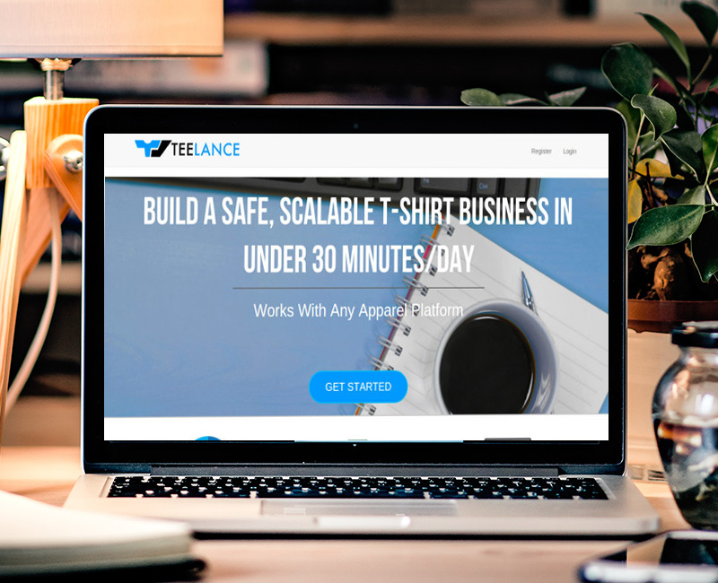
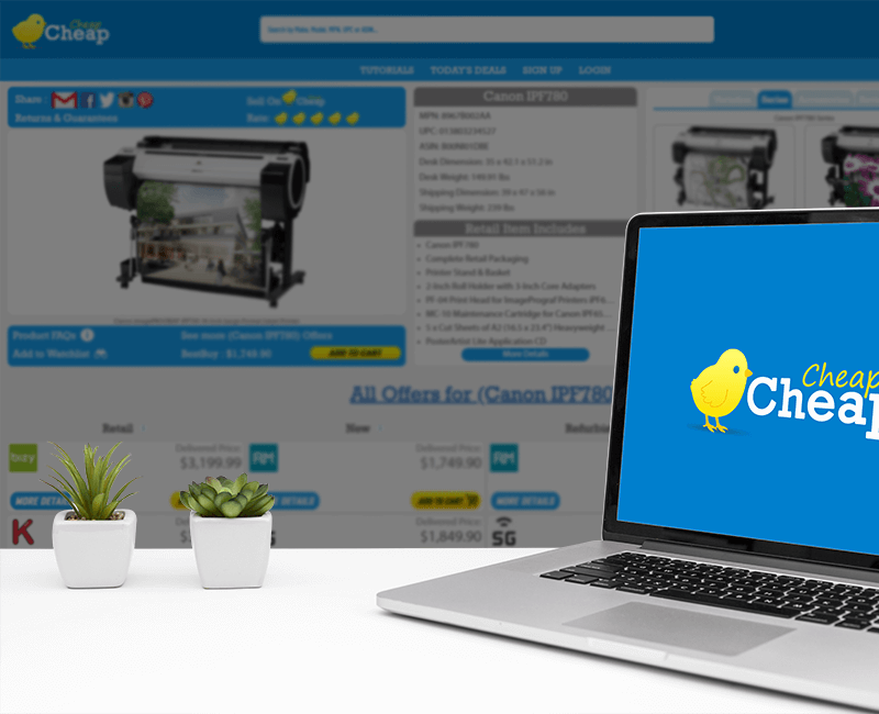
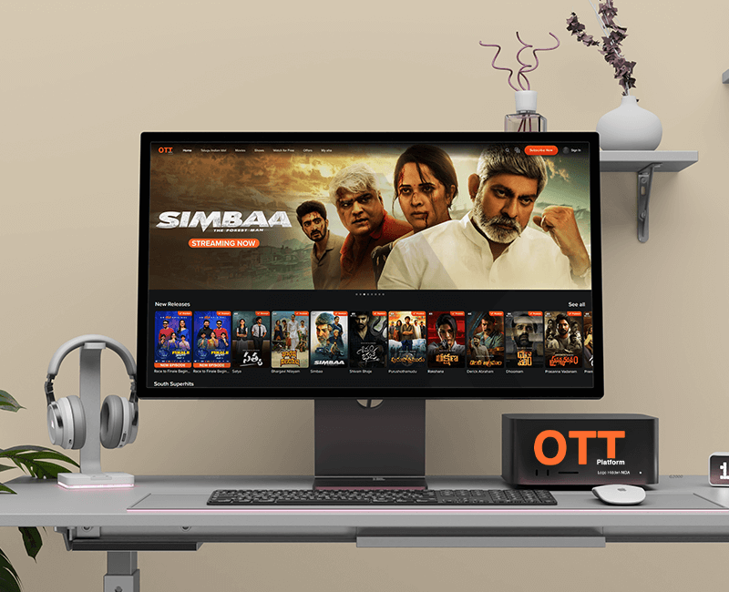
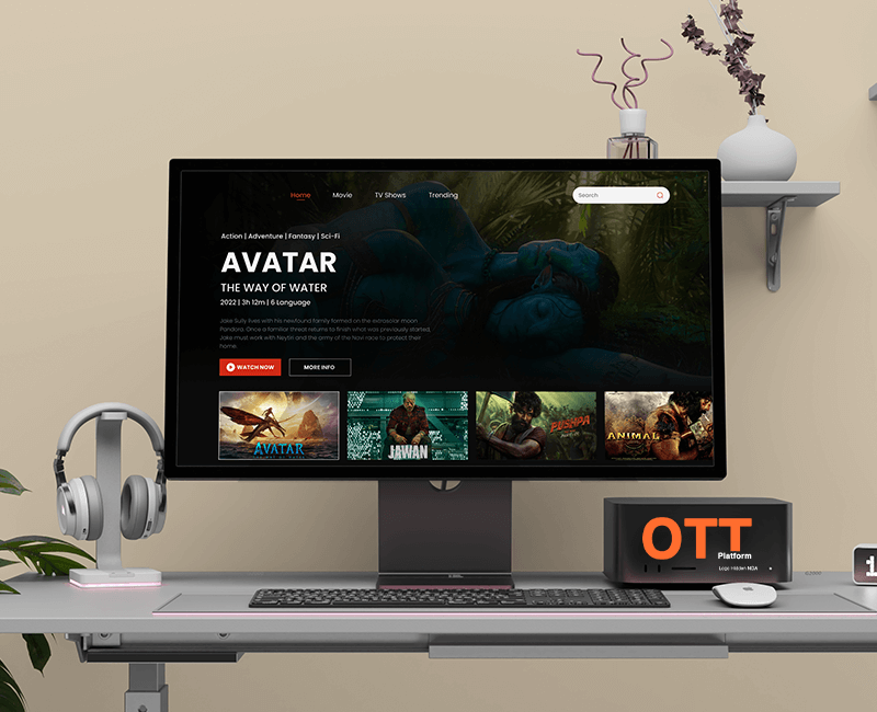
Showcasing the brilliance behind our unique solutions.
 © 2022 - 2026 | Aglowid, All Rights Reserved.