Quick Summary:
There are more than 8 million apps worldwide across all platforms! To compete in such a closely packed market space, your app needs to match its function with its design and appeal to your potential customers to keep their attention and interest. Redesigning an app has many layers and aspects that should be discussed at length before taking the leap of faith. We have summarized the best practices for app redesign in this comprehensive blog for you.
Redesigning an app is often looked at as a last-minute panic solution to avert a crisis that has fallen on the company thinking about it. However, this is a global stigma and holds no ground.
You do not necessarily need to go south to wake up one day thinking I need to redesign my app to save my sinking ship. Many times, the need for redesigning an app comes from positive aspects and planning as well.
App redesign is a tricky process to understand. When, on one side, you shouldn’t need to wait for a crisis to redesign your app; on the other side, you cannot just randomly decide to redesign your app without giving it much thought or impulse as well. In either case, you need a proper plan of action before redesigning your app.
When to Redesign your app – Factors to consider
“The cost of not redesigning your app when needed is substantial, but so is the price of redesigning your app when it is not required.”
With that in mind, you should understand how delicate and important the decision to redesign your app can be. It can be confusing; hence, we will clear it up for you:
When NOT to Redesign your app
- Your app is widespread, and you have no complaints from your users.
- Your app has a classic established design that, if changed, would repel the consumers. (Scrabble Go)
- The cost of redesigning your app will be higher than the revenue generated from that investment.
When TO Redesign your app
- You are rebranding your business
- Users have shown dissatisfaction with your existing app
- Your app design has become obsolete
- You are aiming to target a new audience
How to redesign your app – App Redesign Process
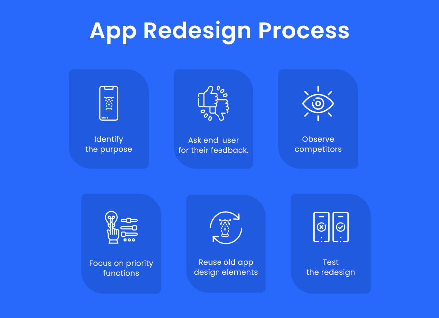
Now that we have understood when to redesign your app and have decided to continue with app redesign for our project, we should look into ‘how to redesign an app effectively’. So here is a step-by-step guideline that you can use when you redesign your app.
- Identify the purpose of redesigning your app.
- Ask end-user for their feedback.
- Observe competitors
- Focus on priority functions
- Reuse your previous app design elements
- Test the redesign
1. Identify the purpose of redesigning your app
As we discussed briefly earlier, it is very important to have clarity in terms of why you need to redesign your app and what purpose will the redesigning process solve.
Having that sense of clarity will help you work on the right solutions from the beginning without wasting any time, costs or futile efforts that won’t end up solving any of your issues.
There are important considerations to be kept in mind for different app redesign purposes. Let us briefly discuss them all:
Purpose #1 – Company Rebranding
If you are going to rebrand your company entirely, you must redesign your mobile and web apps accordingly.
You need to be persistent and consistent with your target audience so that they can recognize your brand post change and maintain their regular visits to your app.
In addition, you need to focus your efforts on consumer awareness to ensure that redesigning your app doesn’t backfire.
Purpose #2 – Reduce Consumer Dissatisfaction
One of the clearest indicators of the need to redesign an app is the evident user dissatisfaction displayed on the PlayStore and AppStore ratings or any other marketplace where your app is deployed.
Therefore, it is generally a good idea to use these criticisms as potential clue points to identify general pain points of your audience and take them as crucial improvement areas that you can work on when redesigning an app.
Purpose #3 – Redesigning an obsolete app
Imagine having a Windows 95 look alike app on your Windows 8, 10, 11 based desktop. Your app would be updated functionality and features wise, but if your app does not look visually appealing or adheres to the latest app design trends, it will look and feel out of place.
Due to this, many users will be sceptical about downloading or using your app. The overall app design trends have seen tremendous changes from 2011 to 2021.
We have shifted from complex clustered and crafty apps to minimalist, skeuomorphism and flat icon design styles. App design in 2021 focuses more on highlighting the content in the best light possible.
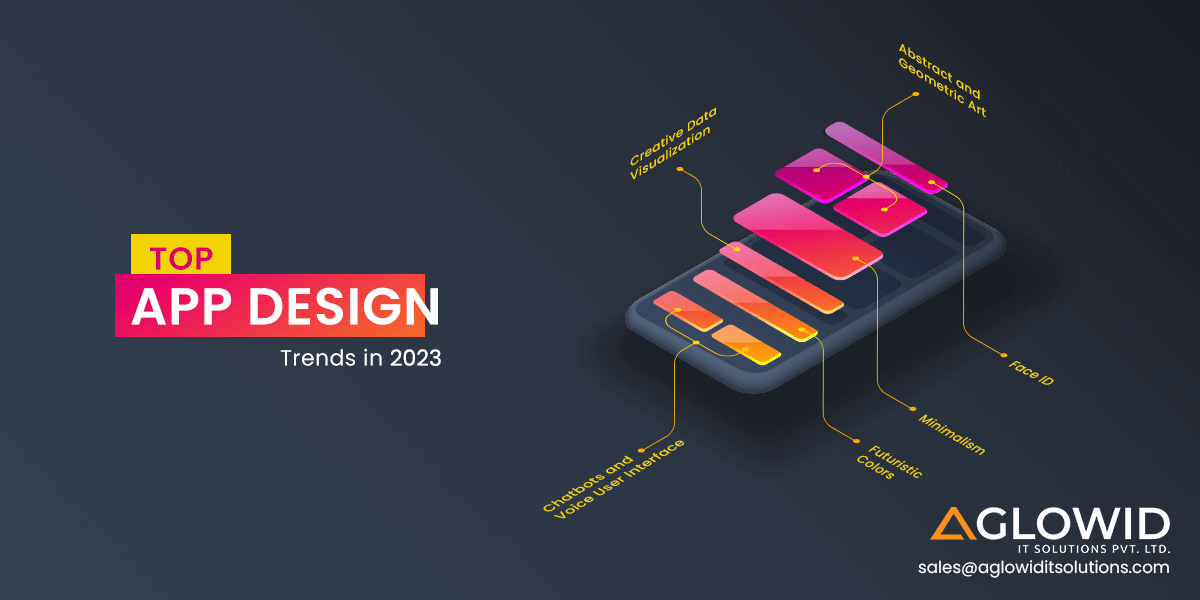
Also Read: Top Mobile App Design Trends in 2021
Purpose #4 – New Target Audience
One of the reasons to redesign your app can also be targeting a new audience for your app. Here there are two possibilities – complete change of target audience or addition of a new target audience.
If you are planning to change your target audience entirely, that would be as good as rebranding your business, as we discussed before.
This is still relatively straightforward. However, if you are adding a new set of the target audience, that can be trickier.
You need to find a balance in your app redesign process that appeals to a new audience and does not repel your established customers.
2. Ask end-user for their feedback
Since you already have a pre-published app on the Google Play Store or Apple App Store, you can check your app’s overall rating, comments and other metrics to understand the general perception around your app.
You can also include a poll inside the app if your users are willing to fill it. User feedback won’t generally be as crisp or seem legit as end users have a different perspective on app usage than a designer. However, they will use or not use the app, so you should take their words for their merit.
General complaints or suggestions from users can be:
- The colours are too dark
- Buttons are small, causing accidental clicks
- It doesn’t feel very true to the niche
Incorporate this feedback and make necessary improvements when you redesign your app. Your users would be more than happy and feel valued when they see you take their inputs seriously.
3. Observe your competitors
Just because you haven’t got it right doesn’t mean no one has. And you’d be complacent to ignore the possibility of finding the right app design solutions from your competitors existing apps.
Since these apps are free to download, you should download all the competitors’ apps and use them thoroughly to understand why their app design works.
Identify key winners from many apps and then merge them with your underlying app design principles to create a unique and functional app design.
4. Focus on priority functions
Most times, most functional apps fail simply because they don’t have a properly organized user interface.
There are two primary challenges a user can face with app design: screen size limitation and inability to access the app’s core functions.
Decluttering the main functions from the surrounding functions can be very daunting and challenging for any app designer.
Hence, you should try sending push notifications or surveys to your users, asking them to mention the most important features they want access to from your app.
Then, you should first eliminate the features that might be of no importance and then redesign the app with the shortlisted features.
5. Reuse your previous App Design elements
Like code reusability is one of the best app development best practices, you should also reuse your previous app design elements when redesigning an app.
The more app design elements you can use from your current repository, the lesser the overall app design cost.
This practice also helps preserve the core functions and the most valued design elements for users to feel connected to the newly designed app.
6. Test your app redesign accurately
As you won’t deploy your app on the app marketplaces without conducting thorough testing, you should also not launch your newly redesigned app on the marketplaces without testing them properly beforehand.
It is always a good practice to first create a prototype of your new redesigned app and test it with a group of users who belong to the target audience you are targeting. Do not test via randomization, as it would barely provide useful insights.
App Redesign Best Practices
Here are some of the best App redesign practices that can help you plan, understand and deploy an effective app redesign solution for your apps. These are the best practices for redesigning an app:
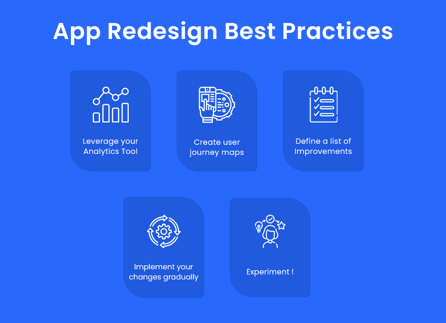
- Leverage your Analytics Tool
- Create user journey maps
- Define a list of Improvements
- Implement your changes gradually
- Experiment!
1. Leverage your Analytics Tools
Analytics is one of the most reliable and effective tools for studying your app stats, monitoring your app functioning, and getting a better idea of your overall app performance.
Using your analytics tool, you can pinpoint negative impressions and then try to find the reasons behind that behaviour.
Key Aspects to look for in Analytics Tool
Some key aspects you can check with your Analytics tool are:
- Goal completion factors
- Active users to all users ratio
- User satisfaction metrics
- App activation rate
- App drop rate
Have a unique app Idea?
Hire Certified Developers To Build Robust Feature, Rich App And Websites.
App Analytics Tools
Now that we know what to look for in an app analytic tool let us quickly overview some of the promising app analytics tools that you can use –
1. Google Analytics
Price: Free (Custom tiers for enterprise) | Type: In-app| Platform: iOS, Android
Google Analytics allows marketers to understand user behaviour and view live data usage with real-time reporting support. It offers a wide variety of features for tracking your app stats like –
Key Features of Google Analytics
- Works on any platform
- Provides all kind of information about your users like:
- How they access your app?
- Where are they located?
- How long do they use your app?
Pros and Cons of Google Analytics
| Pros | Cons |
| Works best for multi-channel products | No cohort analysis |
| Provides performance analytics | No integration with iTunes |
2. Flurry Analytics
Price: Free | Type: In-app, Performance | Platform: iOS, Android
Flurry is one of the top mobile analytics platforms on the market. Their software is integrated with Yahoo Developer Network.
It doesn’t only provide the standard set of in-app analytics but also provides crash and error reports.
Key Features of Flurry Analytics
- Real-time data processing
- Flexibility in answering the most critical questions related to your business
- Adaptive workflow to best match your style of working
Pros and Cons of Flurry Analytics
| Pros | Cons |
| Entirely free with no data limits | No website integration |
| Provides crash and error analytics | – |
| Provides detailed demographic estimates | – |
3. Facebook Analytics
Price: Free | Type: In-app | Platform: iOS, Android
Who better than Facebook for data collection? Right? Hence, using Facebook Analytics only makes sense for getting a proper overview and insights about your app.
Key Features of Facebook Analytics
- Creating a custom audience of your most valuable customers
- Make use of cohort reports
- Access to exciting headline stats
Pros and Cons of Facebook Analytics
| Pros | Cons |
| Enable Push Notifications as per user behaviour | Too much dependency on Facebook. |
| Gives insights and trends prediction | – |
| Identifies top customers | – |
2. Create user journey maps
Whom are you redesigning your app for? Your users! Who is your best source for identifying the best app resign solution for your apps?
Your users, that’s right! Understanding your user’s journey before redesigning your app can help you create an app that is easy to use and hence appealing to more and more users.
You should start with a user journey map that visually illustrates the basic user flow through your app.
Using these visual illustrations, you can identify the bottlenecks driving users away from your app.
If your app is a multi-purpose store with many features, break the different segments to different fragments, so users do not feel overwhelmed seeing everything at once.
3. Define a list of Improvements
Now that you have figured out which steps in the entire user journey are causing your audience to drop off and uninstall your app, you should list down these repairs and improvements.
Having a list of challenges and problems will help you move through your app redesign process with ease, as you would have a list of definite issues that you are trying to find solutions for.
4. Implement your changes gradually
You need to understand that an average user does not expect/prefer monumental changes in their applications overnight. It confuses them, irritates them and makes them feel lost.
This is known as baby duck syndrome, and there have been many studies that indicate users do not like changes.
Especially if they need to deal with many changes all at once, you need to gradually introduce new changes step by step for giving users the time and opportunity to understand these design changes and appreciate them.
You should also provide a walkthrough to your users that help them understand the new changes of the app redesign.
5. Keep Experimenting
Redesigning an app brings many new opportunities to your app that can amaze your users and provide them with better efficiency.
Most wow features like scheduling a ride, tracking location, real-time audio and video-call capabilities have become the new normal.
Hence, keeping up with the trends and trying to find the next wow factor if it sticks to your app’s functionality is a good practice and a required practice to stay alive in this competitive app era.
AR based apps are most often developed and popular for gaming apps, however IKEA changed this perception with its new experiment – IKEA Place.
IKEA place is the second most popular free app built using Apple’s ARKit if we compare by number of downloads.
It is a functionality based AR app that helps users reimagine their physical places with virtual reality, allowing them to get a better understanding of what they’re shopping for and how it will look in their personal spaces.
Being a function-driven app, it has managed to rank better than most gaming apps available on the app store.
This shows how incorporating new technologies for your business can help you solve a problem you didn’t even know existed.
App Redesign Checklist
So far, we have understood when, why and how of app redesign. Now we should also focus on how to test the efficiency of your app redesign process.
We have a quick app redesign checklist for your reference to check if your app solves any of these app design problems effectively.
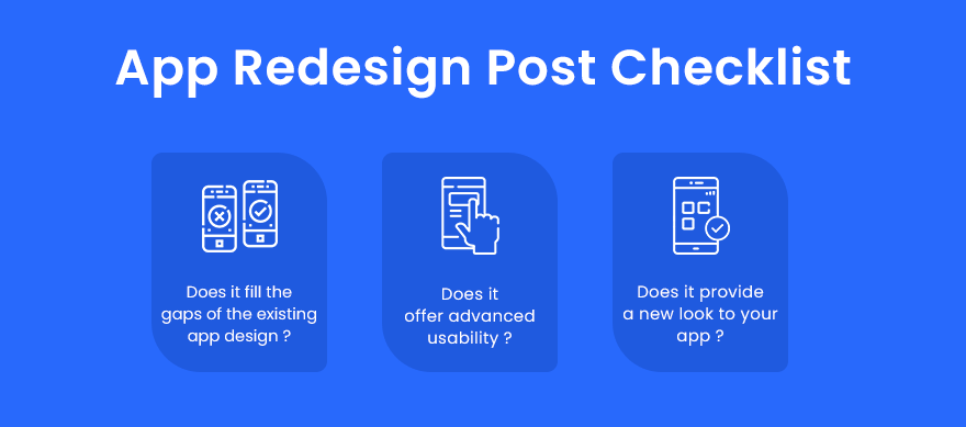
- Does it fill the gaps of the existing app design?
- Does it offer advanced usability?
- Does it provide a new look to your app?
Popular App Redesign Case Studies
What can be a better source of inspiration than global known brands when understanding the impact of redesigning an app! So here, we will talk about some of the most beloved apps you use and how their app redesign process helped them achieve their business goals.
1. Uber Redesign
Uber is no stranger to rebranding and redesigning its app. If we talk about their logo, the brand has changed its logo 5 times over only a decade.
Though this is not an ideal inspirational case study on how to go about redesigning an app, we can derive from their years of experimentation some notable learnings.
Key new features introduced in Uber App Redesign:
- Made the text more comprehensible and visible when a driver reaches closer to the pickup spot.
- Important details like Driver’s Name, License Plate Details, Car color/company/model are easier to find.
- Added Spotlight that makes it easier for your driver to find you in a crowd.
- Added integration to directly access Uber Eats.
- Changed the display illustration and animation for available cars.
2. Instagram Redesign
Instagram is currently the Facebook of today’s generation. It is widely popular and has many unique features for sharing photos and videos with friends, family and peers.
Though not as frequent as Uber, Instagram has also seen some monumental app redesigns over the many years. However, while the app design saw significant changes, it somehow didn’t feel very overwhelming to users when it got introduced.
This is because they didn’t hamper or alter their app’s user flow, hence keeping the fundamentals the same.
Key new features introduced in Instagram App Redesign –
- Black and white tool icons for image editing.
- Changed its design style to a minimalist design with neutral colours.
- Added support for the dark theme.
“Want to Transform your existing App?”
Now Get Better User Experience & Improved User Retention with Aglowid
Wrapping up!
These are the best tips and tricks to redesign your app efficiently. Redesigning your app can bring many new possibilities to your app, giving it a second chance at captivating the market and staying ahead of your competitors.
Ensure always to stay updated with the latest App Design Trends and keep making minor or gradual changes to your app if needed. Don’t compromise the core of your brand or content by over-optimizing the design of your app.
