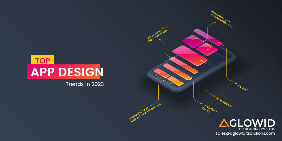
It is essential to stay updated with the latest app design trends at all times. These trends tend to change within weeks and months, and catching up with them constantly can be challenging. However, if we break them down to yearly reviews, some of the best app design trends prevail longer than weeks or months. They maintain their popularity for a long time, as they bring a sense of freshness and relevance to mobile UI/UX design. At the same time, some app design inspirations are entirely new and come to live after constant research and development. The same is true for app design trends. This year we will see some of the most popular app design trends make a comeback whereas some brand new design trends would unlock new possibilities for developers, designers and users.
Today, technology is getting smarter quicker. And many companies are getting on this fast train by leveraging mobile technology and innovations. The importance of mobile app developers is increasing by the day. They’re gaining attention for their coding skills & improvising and constantly coming up with new app design ideas.
For any app to even be ‘acceptable’ these days, they need to have their UI/UX design according to the iOS and Android platforms’ trends. For this UI and UX designers need to work together in unison to prepare the applications for both – function and design. The mobile app design should also be able to match with memory and performance management of the apps.
Technical advantages for adapting Mobile App Design Trends
“Design used to be the seasoning you’d sprinkle on for taste; now it’s the flour you need at the start of the recipe.” – John Maeda, Designer and Technologist
Most people look at app design as the garnishing over a finished product(app) as if it is an additional effort to market an app better. However, this is far from the truth. At least in today’s context – mobile app design isn’t about adding taste; it is a core component of making a functional and effective app. Here are the core functional and technical benefits of implementing some of the most practical mobile app design practices.
1. Information Architecture
Any company must showcase their information so that it is – engaging, readable and in the correct sequence of most important – to lesser important content. A viewer’s attention should go where the business intends it to go to. This is achieved through strategic planning from the developer and designer’s side by leveraging mobile app design tools to highlight the important content so that it contrasts from the rest of the content.
2. Makes the app more interactive
A well-designed app promotes easier app interaction for users. If you launch an app without adding design formatting to its layout, the app could be confusing for the users to comprehend. There would be no proper formatting, no distinction between app elements, and no symbols to navigate the app.
Now we know app design plays a major role in enhancing an app’s functionality and visuals. Next, we should look at the best app design trends that will help you create a unique and efficient app. For better understanding, we have further divided these trends into different categories for you:
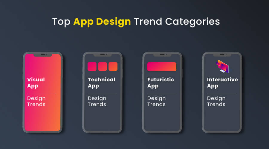
The four broad sub-categories are –
- Visual App Design Trends
- Technical App Design Trends
- Futuristic App Design Trends
- Interactive App Design Trends
I. Visual App Design Trends
Visual app design trends are those app design practices that focus primarily on any app’s look and feel. Most innovations and changes in the mobile app design trends take place in this broad category only. Since it is a broad category, we have further divided it into useful sub-categories to understand better these new unique mobile UI/UX design trends.
Concept-based App Design Trends Concept-based design trends are such app design trends that have taken inspiration from a larger designer movement or a historical movement that has impacted several niches and not just mobile app design. These movements are often powerful and have stood the test of time in remaining relevant over the years since they bring many benefits to an app design. Some of the most popular concept-based app design trends are:
1. Neumorphism
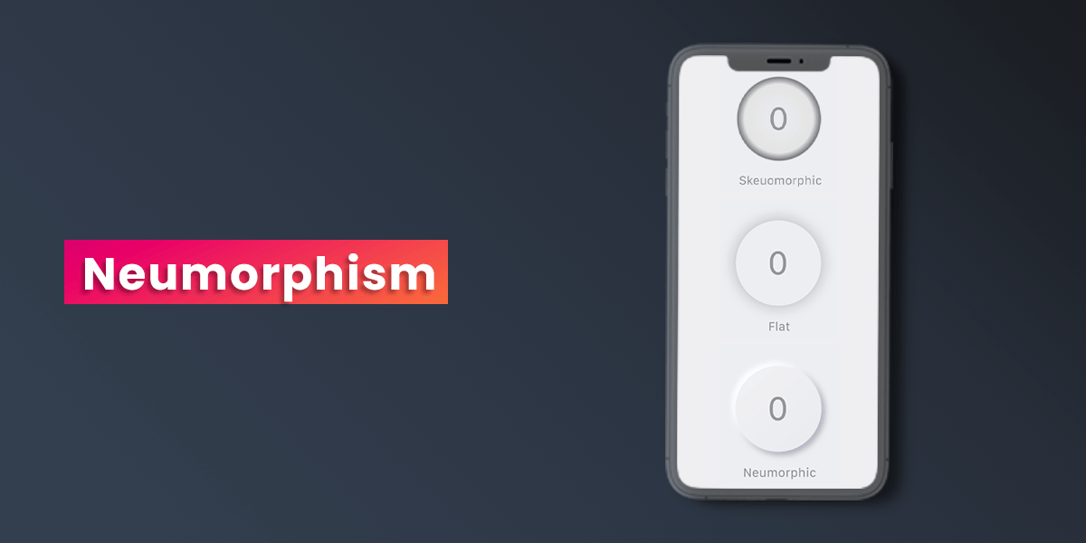
Neumorphism is a design trend that is derived from Skeuomorphism. Skeuomorphism is a term used to describe interface objects that mimic their real-world counterparts in terms of appearance and how a user can interact with them. The best example to understand this concept is the recycling bin icon used to discard files/apps and other content. The idea is to make interface objects familiar by connecting them to the everyday objects we use in the real world.
Skeuomorphism is related to the concept of affordances. Affordance is a term used to describe the action possibilities for certain objects or features of the environment. For instance, door handles are designed in a way that the user understands that they can be rotated. Skeuomorphism takes this concept of affordances and applies it to the digital user interface.
Skeuomorphism was a popular app design trend back in 2012-13, and in the subsequent years, the flat design got wide popularity. In recent years since 2019, designers started using UI concepts that can be considered as something in-between Skeuomorphism and flat design trends. The interfaces made with this new concept weren’t as literal and real as Skeuomorphism, but they weren’t entirely flat and simple as seen in flat design trends. This balance of app designs that had both – the volume that was missing from flat design and softer layouts that killed Skeuomorphism’s over-literal nature-is known as Neumorphism.
Neuomorphism implements a minimal approach to any app design while giving a 3Dish feel to the buttons and other interactive elements. Neumorphic elements sit on top of the background surface. They are usually in a raised shape made from a similar material used for the background. It can either be the same color or slightly different from the background. The UI elements are not put on the background but behind it. This gives a feeling that these elements are inside the background. Use of solid colors with low contrasts makes this design trend appealing to masses.
2. Retro Inspiration
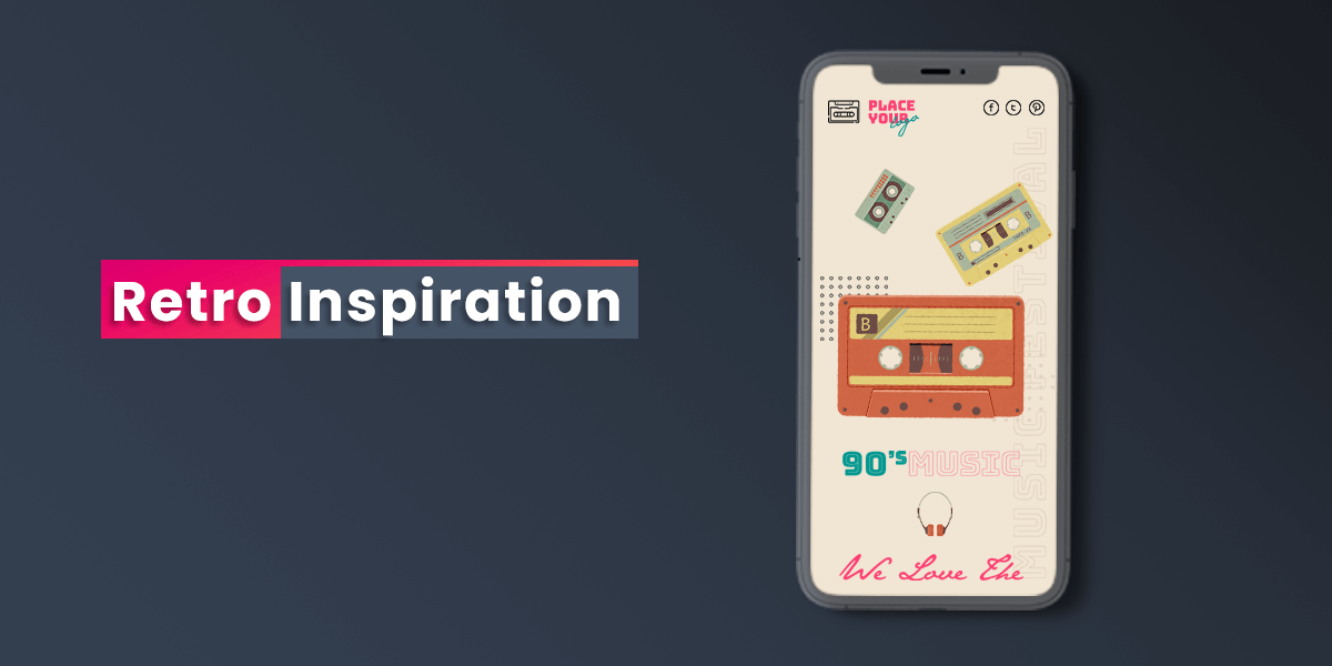
The moto for app design trends for long has been – the modern the better. However, in recent years, mobile app design trends have often taken inspiration from objects, colors or elements that give a sense of nostalgia or familiarity. When we look at all the app design trends these days, they more or less have the same ‘digital’ feel to them. They look similar to an extent. In times like this, choosing a retro-inspired design is a conscious choice to create individuality and uniqueness. It helps the brands create a different design from designs created by the advancements and capabilities of a computer.
When you compare pen-to-paper to software in terms of capabilities, the software has more ease and various tools. However, with paper, there are no limitations to creativity or no set of fixed rules either. This sparks creativity. This is why most designers and developers do believe in doodling their app vision and layout on a piece of paper and then trying to reach that authentic feel digitally as much as possible. Several apps have resorted to retro-inspired design principles for their initial logos or app design.
Examples of retro inspiration apps are-
- Instagram – The toy camera app
- Terraria – Flat 2D gameplay
- Hujicam – Retro camera layout
3. Minimalism
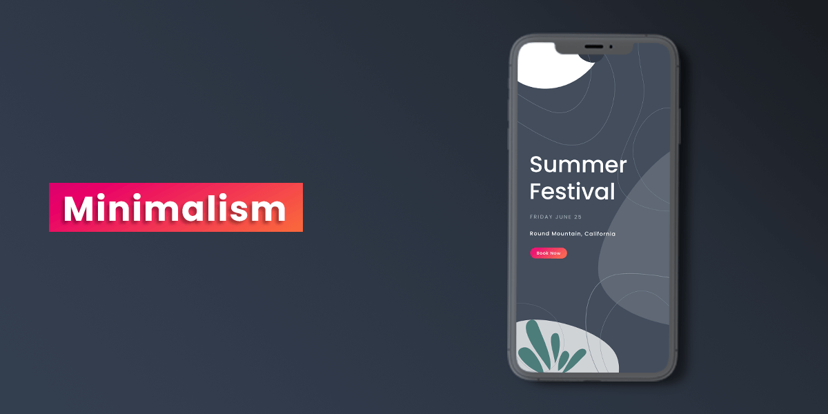
Minimalism is one mobile app trend that is not going anywhere soon. With the ever-increasing complexities of mobile app and their functions, the simplicity and clarity brought by minimalistic design to the layout have only helped users keep up with ease. Our smartphone screens are of limited, confined sizes. UI/UX experts need to use this space to create engaging and appealing something at the same time. Most people would think utilizing the entire design area and filling it with design elements would be the best way to achieve this. However, if you play with one or two elements and leave room for whitespace, the design looks clean, uncluttered and professional. From the users’ point of view, they want two things from an app – appealing design and ease of use.
Minimalism in mobile app design doesn’t necessarily mean to leave intentional white spaces. Minimalist design refers to create a harmonious synergy of all forms and functions. The main focus of minimalist design in mobile UI is to ensure no distracting element that diverts the user’s attention from the main task. After all, you are installing an app to use it, and not to admire its UI. Minimalism understands this. The common perception of minimalist design is that it is easier or a lazier approach to design.
However, the reality is literally on the opposite end of the spectrum. Making a design that is engaging and appealing simultaneously tells the brand’s story is more challenging than making a pop-art collage of color splashes everywhere. The minimalist design helps apps have less visual noise, as well as reduces their load time as there are lesser elements that affect app speed. It pushes the content forward, making CTAs more clickable.
Examples of minimalism design trend apps are –
- Apple Music
- AirBnB
- Google Calendar
Shapes – App Design Trends Shapes hold more value and influence in terms of design than more developers or designers realize. There are psychological inferences connected to different shapes and how they’re placed and used. Utilizing shape psychology more efficiently can be the key to improvising user experiences. Broadly categorized there are three primary type of shapes – organic, geometric or natural. Every year there are a few changes in the most popular shape design trends. Changing shapes is the best way to break the monotony in an app design. These are the best shapes related app design trends:
4. Rounded/Organic Shapes
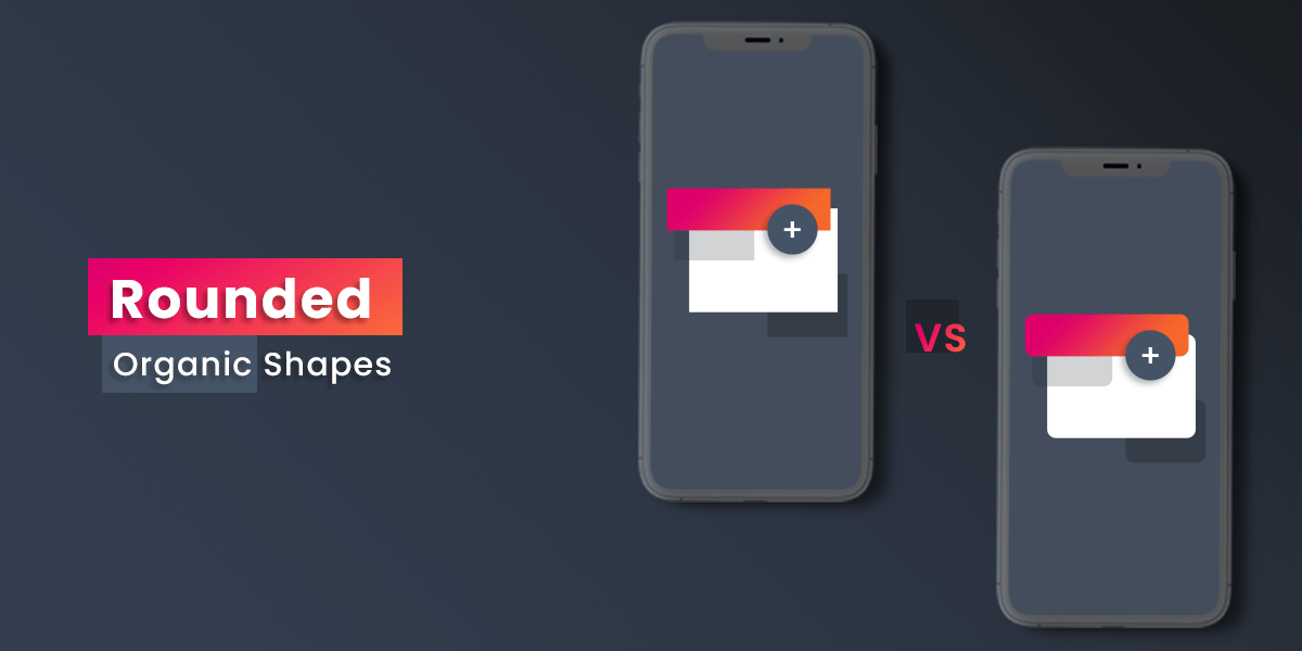
This year is going to see many rounded shapes in mobile UI. In decorations, layouts, and buttons, round shapes often appear. Circles, ovals and ellipses as per shape psychology portray eternity that has no beginning or end. If you consider most cosmic objects like the moon, sun, and earth, all relate to circle or rounded shapes. For these reasons, rounded shapes provide a sense of magic, secrecy and mystery. Since they don’t have angles, the overall shape comes across as softer and friendlier too. For this reason, mobile UI looks more organic, pleasing and friendly when you use rounded shapes. It helps distress the user in stressful situations and eliminates negative experiences if there are technical issues or bugs.
Examples of rounded/organic shapes apps are –
- Speedtest.net
- Facebook Messenger
5. Abstract and Geometric Art
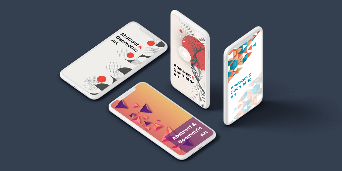
Top design trends are mostly geared towards design trends that promote realism and dimensional effects. However, many brands or projects will find abstract and artistic styles complementing their business better than realistic design trends. Abstract and Geometric arts can also be used in place of photographs if you don’t have professional high-res photographs. Abstract shapes are not an everyday occurrence; hence they easily hold the user’s attention without hampering the user’s ability to use the app with efficiency.
Using this design trend is best for designers who want to find a delicate balance between details and simplicity. Now designers are going to experiment with abstract and geometric illustrations/imagery more. The geometric elements will provide overall structure to the design while abstract elements will help it stay flowy and not rigid.
Look and Feel App Design Trends We bundled some of the best looks and felt app design trends that otherwise could not be clubbed together. These list of individual design elements are unique, fresh and pleasing to the eyes. They help make the contents of the app look more aesthetically pleasing. Here are some of the mobile app design elements that improve the UI/UX significantly:
6. Improved Digital Illustrations
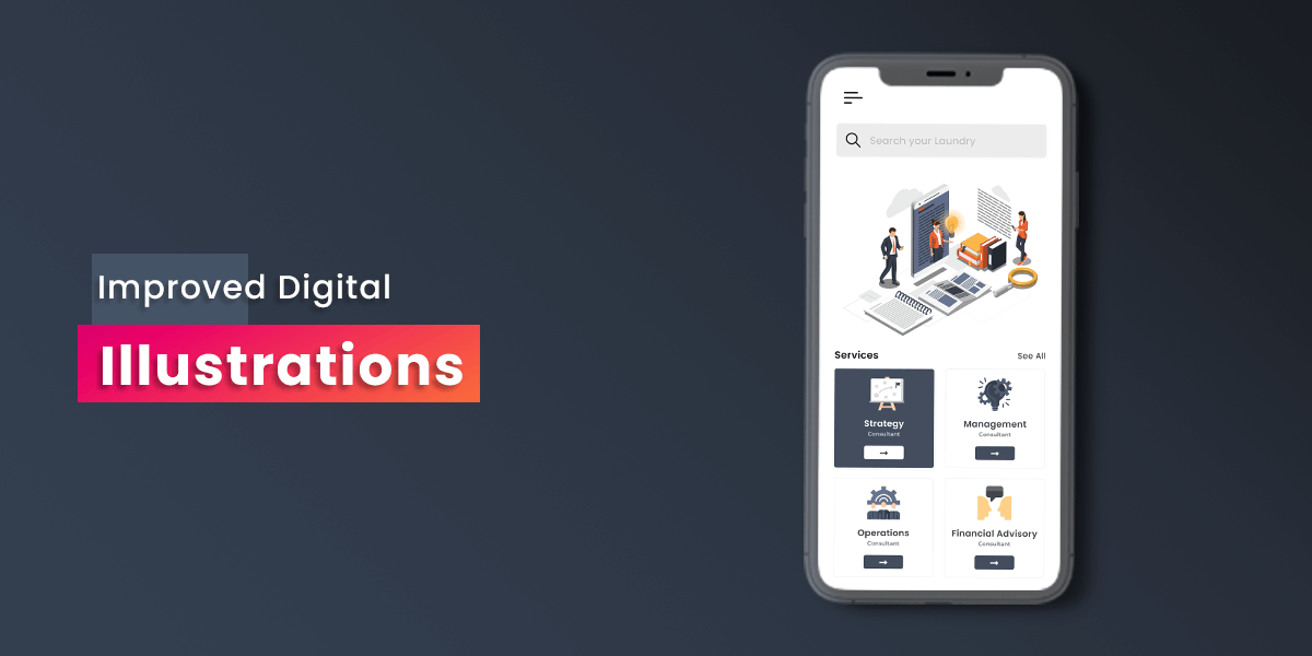
With the extensive increasing resources for illustration files, the designers have started using illustrations in a monotonous non-emotional manner. The illustrations show some visual relevance to the content without really putting much effort or thought behind it. Now, this will change. We can expect improved digital illustrations that aim to produce an emotional effect. More designers would try to experiment with new styles of illustrations instead of sticking to static or tried and tested ones. From this, we can expect to see many interesting digital illustration trends for mobile apps. Educated illustrations that convey a message and emotion would help apps covert more target audience to actual users/customers. This can be picked by NGOs and volunteering apps that convey a simple yet moving message through a powerful illustration in place of disturbing imagery that would be too cruel for people to look at.
Planning to Hire iOS Developers to build reliable interactive iOS app project?
Hire iOS application developers form Aglowid for high-performing, performance-driven, industry-grade iOS applications.
7. Transparent Elements
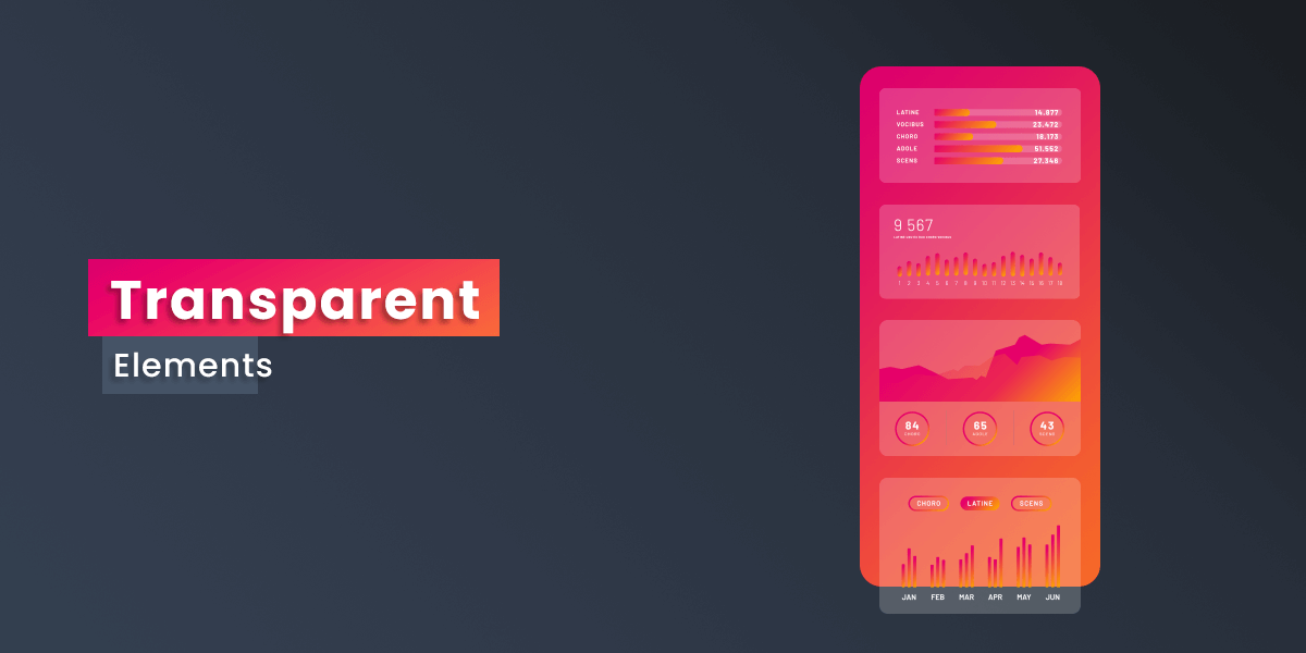
Transparent and semi-transparent elements will be used in most apps, especially on gradients, overlays, and color pops. There will be many designers experimenting with different intensity and methods of including transparency channels in mobile apps. Adding these elements would help create a sense of depth in the visual experience. This would help designers define space and also create a focal point. Transparent layouts help the mobile apps feel light-weighted and push to make the content of the app more visible and appealing.
8. Imperfect Fonts
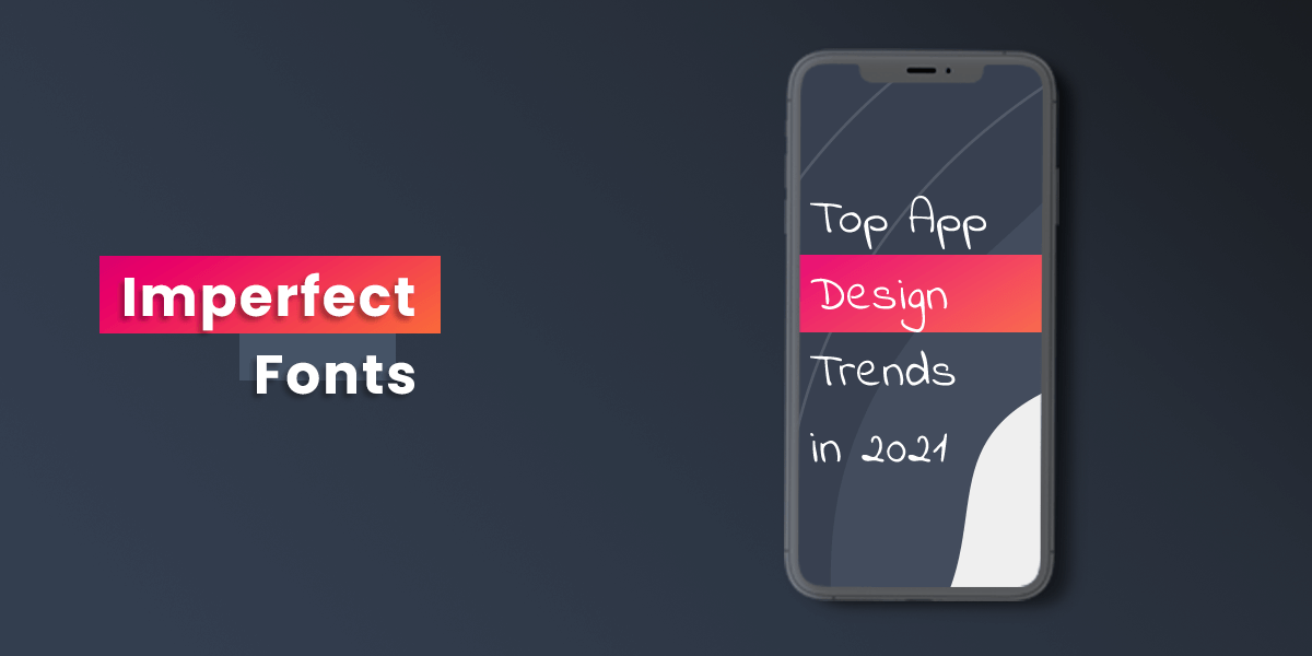
Yes, you read that, right! imperfect fonts. While we generally battle out if serif, slab, sans-serif, brush or letter type fonts are better than the others, this year the typography focus will shift towards the fonts’ feel. One of the biggest barriers in digital media and mobile app experience is the consistency of fonts and text handwriting when we type. While overall, it is a useful feature as it assures legibility, it can, at times, look monotonous and alienating.
Mobile apps targeted towards kids for games or learning will understand this and make use of fonts that look more natural and inconsistent in place of a systematic and neat font. Similarly, there will be many different user-cases where such fonts will be appreciated more. Using imperfect fonts shows vulnerability and closes the technology-to-human gap, making the overall design look more humane, friendly and welcoming.
9. Futuristic Colors
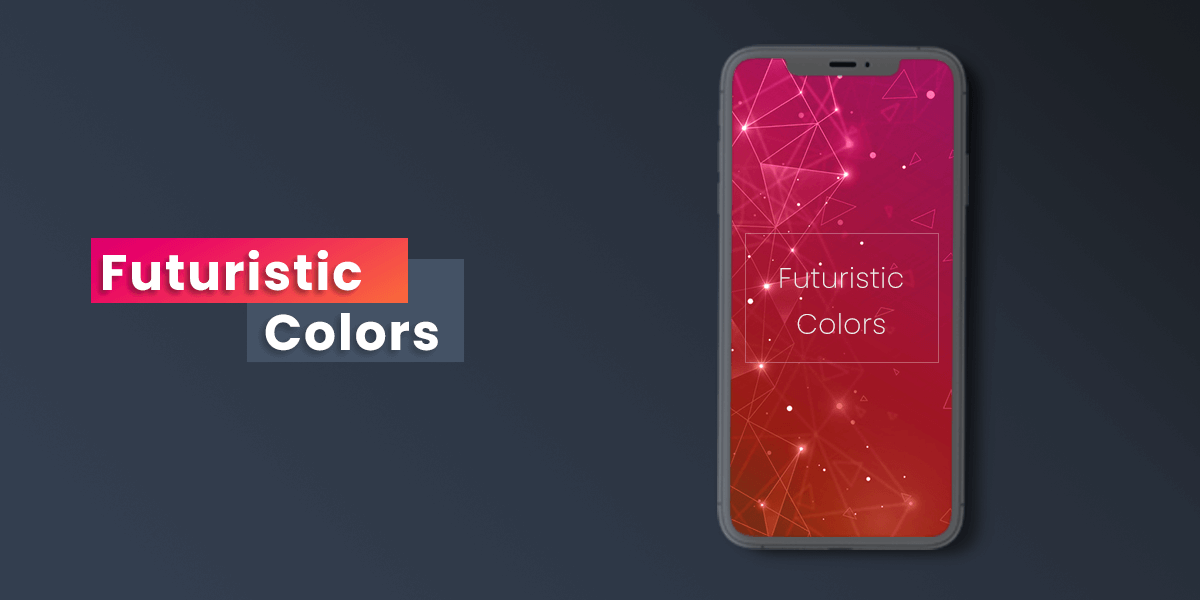
Designers are getting more technically smart and leveraging mobile technology innovations to enhance their mobile app experience. Since most phones have OLED displays now, they have better capabilities of making brighter colors pop. App designers are going for bold and powerful colors that earlier designers would ignore on intention. Colors like purple, pink, blue and other neon colors catch popularity since most apps on the Play Store, and Apple Store are in pastels and subdued colors.
II. Technical App Design Trends
There are elements and components of application design that are primarily built for adding functionality to the app. However, if these components are utilized correctly, they can also work wonders for improvising user experience and user journeys when interacting with the app. It adds a lot of functionality and ease of use for them. Let us have a look at the technical design trends:
10. Motion Design – Animation and Video
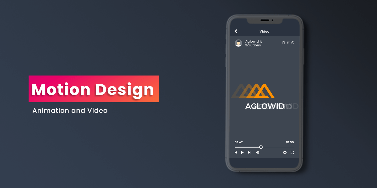
Motion Design, as the name suggests, is the developer’s effects to design movement. It is a standalone design element that can be applied to graphic design principles and app design practices for optimizing video and movable content using visual effects and animation. Users of all age love to see engaging animated or video stories. Motion design helps make the content easier to understand and also makes it appealing to the users. This trend is only going to pick up moving forward.
Earlier the challenges with motion design were that it would lead to serious lag issues and disrupt the flow of the apps. With improvements and constant research, that worry is taken care of. Motion design would revolutionize the way brands tell their story compared to a static image or plain text. They can also act as a breather element in a serious themed app, helping them to get the gist of overwhelming content with lesser efforts. You can also integrate motion designs with interactive elements that we will cover separately in the latter part of this blog.
11. Chatbots and Voice User Interface
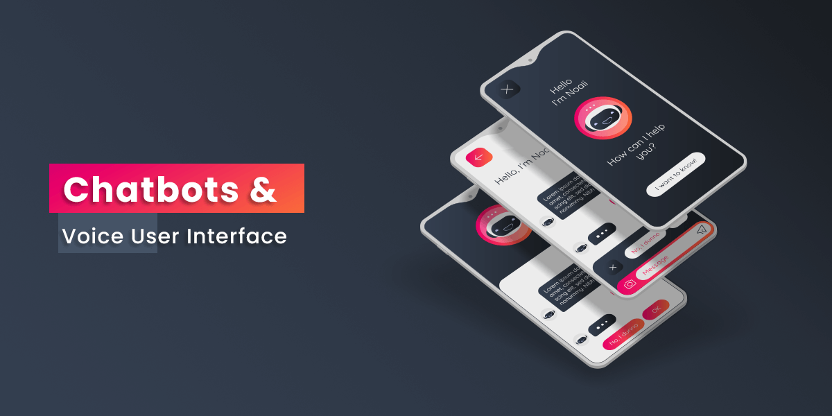
One of the most significant debates is whether using chatbots is better or should the voice-user-interface takeover. A chatbot is an AI-driven software application used for online chatting using text-to-speech instead of providing contact with a live human agent. In contrast, a voice user interface mimics human interaction, where the user can directly talk to an AI-based smart assistant to ask their queries or make their commands. These voice user interfaces would use speech recognition to answer the commands.
Both these technologies already exist in our smartphones. You might have spent several hours on Amazon shopping app to clear out some miscommunication or defect in order by using the chatbot feature. Similarly, you must be using ‘OK Google’ or ‘Hey Siri’ activation commands to verbally interact with your phone. VUI is supposedly going to be the future of customer communication that would also have the capability to predict the future. However, there is a lot of skepticism against voice user interface, too, with its limiting factors such as accent variation, quick and accurate feedback, and more. Still, it certainly is a design trend to look out for, and an interesting comparison to keep your eye on.
12. Creative Data Visualization
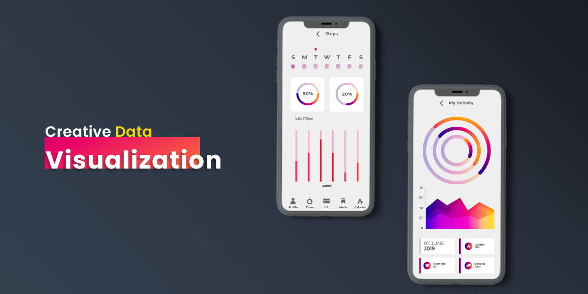
Bar graphs, pie charts and other forms of data visualization used to be fun during school times. As you grow up, these same visual formats get mundane and boring. However, designers worldwide seem to have taken up the challenge of making data visualization fun again. Mobile apps based on data visualization or other apps need data visualization tools for presenting some data and figures to their customers. When you add a little bit of fun to these analytics, your user engagement is bound to shoot up. A unique type of graphs, use of futuristic colors and subtle animations for making the data for stimulating and relevant for users. For instance, instead of stagnant clustered bar graphs, wave graphs look more immersive.
13. Dark Mode
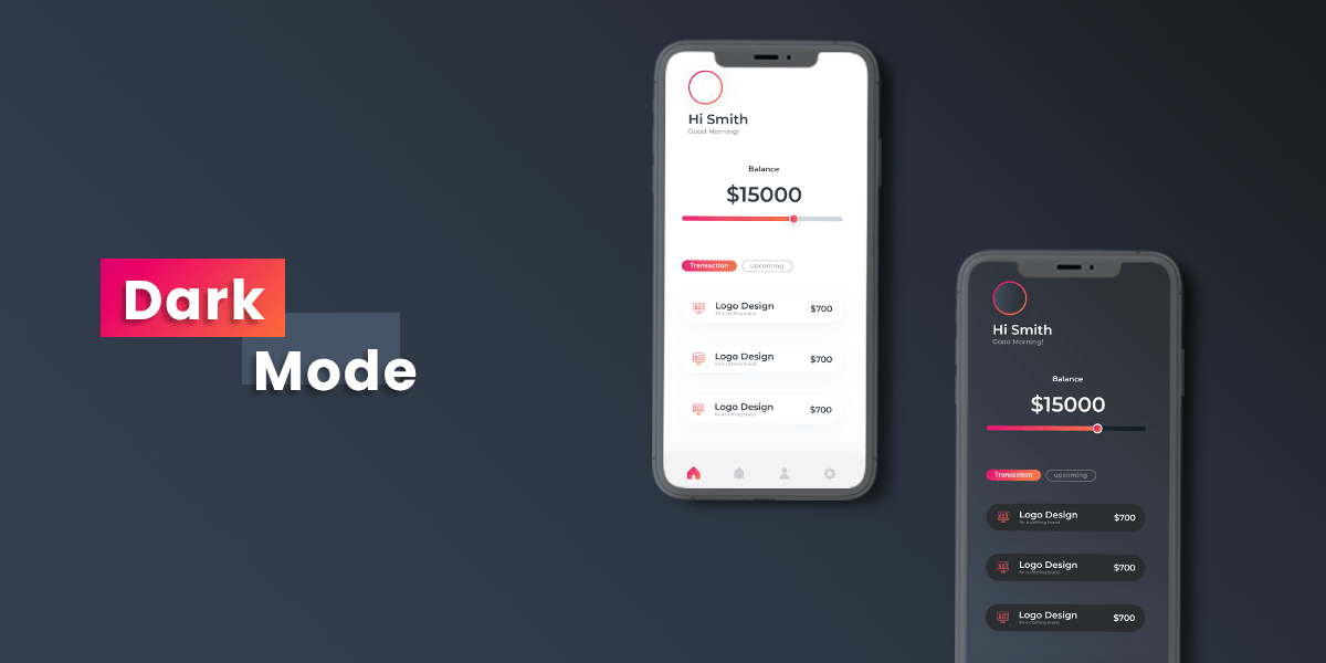
Apple launched Dark Mode during September 19 during their iPhone 11 event held in Cupertino, California. Google also rolled out their support for a system-wide dark mode with its release of Android 10 in the same year of 2019. The dark mode is a technical design trend that has visual, productivity and economic benefits. Using apps in dark mode can prolong your smartphone’s battery significantly. It has been confirmed by the official YouTube channel of Android Developers that using dark mode in OLED displays helps improve the battery life to a great extent. Seeing this, Apple also promised to drop down their LCD screens by the end of 2020 and focus more on OLED screens with their future generation mobiles.
The dark mode is also easy on the users’ eyes, and it looks aesthetically pleasing as well. Many popular apps also got behind this trend to provide their users with the most appealing user experience. Like – Instagram, Twitter, Facebook and other apps on the Play Store and Apple store now has support for dark mode. And this is not going to fade away anytime soon.
Looking for Android App Developers to develop cutting edge native app?
Hire Professional Android App Developers from Aglowid to develop highly scalable and performance-oriented mobile app project.
14. Advanced Animation
Source: Dribbble
Developers are focusing more and more on adding subtle and impressive animations in the mobile app development process. Animations that are informative, crisp, and clean help create a balanced user experience that enhances the story-telling process. Animations should be added in a way that works when users interact with certain screens, input specific data or when they press a button that redirects them to a new frame. They can also be used for transaction processing and confirming that the app has received the user input or simply adds a little groove and rhythm to the flow of user experience. More and more brands are also looking to include a single animation or bundled animations that complement their brand image in their mobile apps. This would help customers feel closer to the brand, enhance their user experience and lead to more engagement and conversions.
III. Interactive Mobile App Design Trends
Many app features and designs require more participation from the user’s side to activate or react. Such features help break users’ monotony using the app with the app merely adhering to what the user asks for. By providing a sense of feedback, it encourages a conversation, or a better engaging experience that piques the users’ interest. Mobile app developers and marketers realize the need to provide new ways of breaking the regular user experience and give the users more than they usually expect from a mobile app experience. The interaction-based mobile app design trends you should look out for are:
15. Engaging Swiping Experience
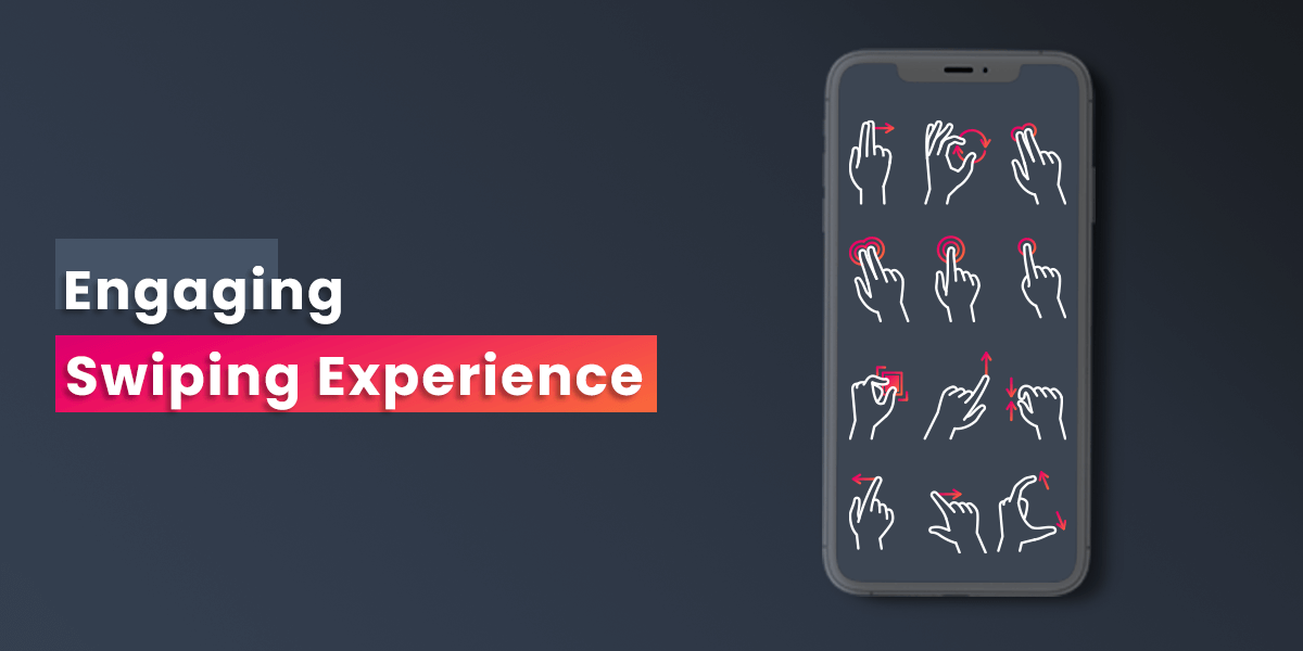
Think about it. One biggest advantage smartphones have over desktops is the ability to touch and interact with the screen instead of using a mouse or a trackpad. There are desktops with touchscreen now, but they still can’t be compared to smartphone touchscreens’ ease and smoothness. More than that, swiping is a powerful and fun tool that makes the mobile app experience even better. App developers now will cash on this feature by including swiping experiences that make the app journey memorable, easy, and interesting.
There can be many different approaches as to how to include swiping gestures to your app. There can be some animation added to the swipe for an enhanced user experience like swiping right to change a page of an e-book with the page-turning animation to mimic the authentic experience. Or it could be deeply rooted in some core functionality of your app.
16. Augmented Reality in UI design
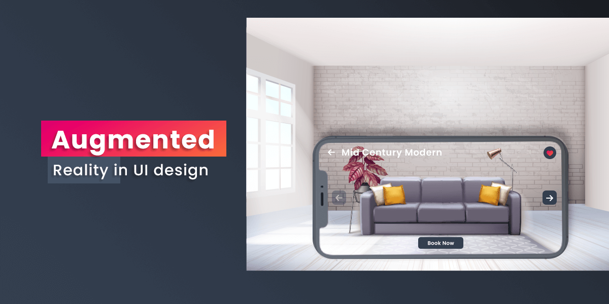
Apple and Google had both announced their AR development platforms – ARKit and ARCore, respectively back in 2017. Not to say that they were the pioneers in the field of AR, but ever since these two giants took an interest in the technology, the world gradually began to embrace this experience in their daily lives as well. If we talk about 2020, where physical interaction was barely possible, AR gained momentum in people’s interest. It is not even an experience that only the big brands are chasing, small companies are also seeing how they can leverage Augmented Reality in their marketing strategy.
AR can redefine or challenge traditional user experience and navigation system by integrating digital and physical world experiences that make the apps look more real and relevant. The challenge and the opportunity with AR for mobile developers are that their playground just got a whole bigger. The UI isn’t limited or confined to the mobile screen. Mobile app designers need to think of the context and the function of the AR experience they plan to include in their apps.
There have been a few notable apps that have worked their magic with Augmented Reality already. Learning about them briefly should help us decode this design trend better.
- Google Translate – The Engine Creative Team at Google managed setting up a basic interface for setting the language and using the camera to turn your phone into a magic lens and fetch text from that you see and translate it to the preferred language you want to translate it to. This is a minimal and simply integrated feature that could help tourists read local signboards if need be. It can also have much other implication and uses.
- Pokémon Go – Pokémon Go got the whole world on their feet. This interactive adaption of the popular cartoon series Pokémon was one of the first games to mimic an actual Pokémon journey even when other gaming consoles like Nintendo Gameboy and DS have been creating video games since ages. It fused the digital world with a real-world using Augmented Reality that enabled people to ‘catch’ Pokémon in their real-world surroundings.
IV. Futuristic Mobile App Design Trends
We like to look into the future. Based on current trends and past trends, many present-day possibilities can surface as mobile app design trends in the near future. These features would bring a real change in how we interact with our apps and change the ‘expected’ threshold for mobile apps. Developers and designers should both lookout for these futuristic mobile app design trends:
17. Face ID
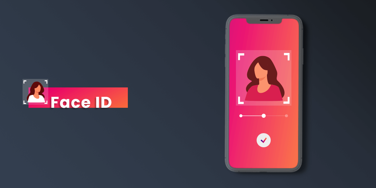
We are already used to using Face ID for unlocking our smartphones. How would you feel about using this feature to unlock your applications? Or see more of FaceID integration with apps to unlock or activate different settings and triggering different actions? Apple is already finding ways to replace Touch ID with Face ID as they believe it is one of the most natural and authenticate way to add security to any app. This is not to say that biometrics would be replaced with Face ID. Biometrics is the most unique and guaranteed way of individualizing oneself from others.
However, we will surely see advancements in the Face ID feature for unlocking more and more apps. iPhone seems first to this market with their TrueDepth front camera in their iPhone X, iPhone XS and iPhone XS Max. They already are planning to integrate mobile banking apps with Face ID with a numerical passcode as a backup.
I think these apps would allow users to add Face ID to their accounts instead of making it a pre-installed feature since it is an additional service that some people might not want or feel like using. They would prompt the user and tell them about the benefits and possible risks and direct them to a section on their app, from where the user can enable or disable it whenever they want.
18. Passwordless Authentication Feature
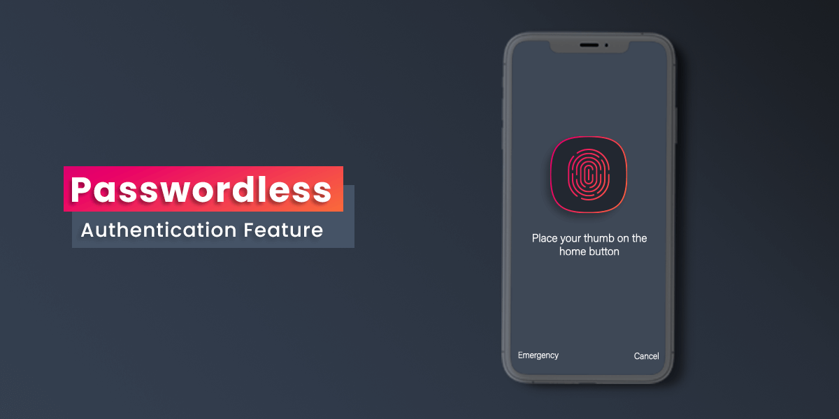
Passwordless authentication is a way of verifying users’ identities without relying on a password or other security question’s answer. In place of passwords, mobile apps will use a possession factor which is an object that identifies a user. This object can be – one-time password generator, biometric signature or other inherent factors. The basic idea is that all the authentication factors are based on the user’s inherent factors, not on something that a user knows, such as passwords, pin code, or a paraphrase. Inherent features are always better to remember and more secure from identify theft, sharing by users and other potential risks.
19. Buttonless Design
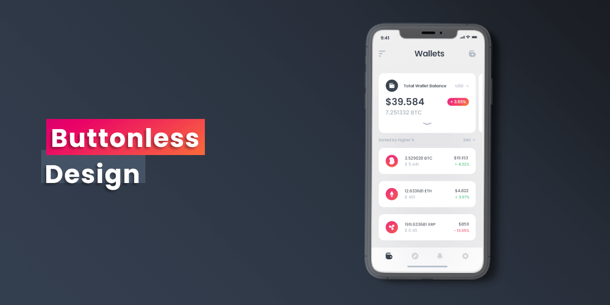
Buttons have been an essential element in any graphical user interfaces since the beginning. However, with the advancement in mobile technology, if you think about it, it has been ages since any of us have used mobile devices that use real physical buttons. There are mobile phones with more than 99.99 percent screen to body ratio that have helped app designers provide us with more content.Mobile App Design Trends and the next decade would include showcasing the content in an appealing manner.
Have a unique app Idea?
Hire Certified Developers To Build Robust Feature, Rich App And Websites.
Bottom line
These are the top app design trends that you should look out for. You can also get latest modern design trend in this link. Most of these trends can dictate how mobile apps will grow for the next decade if not more. The primary goal of these mobile app design trends will be to make the user experience more engaging, pleasurable and comfortable. You should not look at apps as tools anymore, and they have the potential to be your pocket-sized companions. Mobile app designers should note this and take this up as a fun challenge to revolutionize the way we think and approach mobile apps.
